We’ve covered the worst box art of the year, now it’s time to look at the best. An effective videogame cover does two things: it stand out on a shelf next to other box art, and it gets across the general tone or concept of the game. The following covers are ones that I think accomplished this in the most stylish and eye-pleasing way.
#10 Hunted: The Demon’s Forge

Compositions that run along a diagonal of the “canvas” tend to look very dynamic. This cover contains heavy diagonals in both directions: the characters bodies follow a loose diagonal from the upper left corner to the bottom right corner, while the female character’s arms and crossbow and the male’s right arm run parallel to the opposite diagonal. Long story short: dynamic!
The one little change I would’ve liked to see would be having the male character’s sword overlap the logo. This is something done with magazines all the time, which also looks very dynamic. However, when establishing a new IP, it’s considered important to make sure the title is clear and easy to read, so I understand why they opted not to do that. If this had been a sequel to a hit game, however, it would’ve worked really well.
#9 Warhammer 40,000: Space Marine

I would never have expected a game with such a generic title to have such a nice cover image, and yet here it is. This one roughly follows the same diagonal as Hunted: The Demon’s Forge, but in a different way. Where Hunted has the characters charging at a downward angle—conveying a sense of strength and power—Space Marine shows a character fighting at an upward angle, as though he could be overpowered at any moment and will only make it through by the skin of his teeth.
If there’s one thing that bothers me about the cover, though, it’s that bright yellow rectangle at the bottom. Not only is it way too bright, attracting way too much attention (they couldn’t have gone for a color that blended more?), but it’s also off-center. I can’t describe in words how much it bothers me, being so close to being centered, and yet clearly way off. Yes, I realize this makes me sound like a crazy person.
#8 L.A. Noire

I love old painted movie posters, so by extension I love videogame covers that look like old painted movie posters. The logo is fantastic as well, the neon lights helping to establish the time period, on top of looking really nice.
I’m a little confused about the image of the woman who appears to be floating underwater, since there was no case in the game like that. It could just be a case of the artist going a little overboard with the colors. Likewise, making the entire right side (his left) of the detective’s jacket red seems a bit much.
I have to say, though, while I normally dislike borders added over artwork in later editions, I actually prefer the border on The Complete Edition. It sort of acts as a container, making the composition seem more cohesive, rather than just being three unrelated images wedged together.
#7 Halo: Combat Evolved Anniversary

Let’s just call it Halo: Anniversary, okay? This cover almost needs to be seen in person, because flat images don’t quite do it justice. It’s printed on a cardboard slipcover, which is embossed to make the image pop out a bit more, plus shiny foil printed under the visor and the letters “HALO.” Even without the gimmicks, though, notice how focus is placed on the iconic visor by having it be the only thing on the image in color. It’s a wonderfully moody image.
Here’s something interesting, though. When you take the slipcover off, you get a version that doesn’t have the little “BONUS” blurb at the bottom. However, when that portion is removed, it throws off the balance of the image:

On the slipcover image, there’s just as much space between the top of the figure’s head and top of the image as there is between the bottom of the logo and the “BONUS” graphic. Without the graphic, the bottom suddenly looks strangely empty, as if the figure and logo have floated to far upward. Just one of those things.
#6 De Blob 2

Most likely, the first thing you looked at was either the logo (since we often “read” images like we do text, starting in the upper left corner), or you looked right at the big green character who’s taking up nearly half of the image. If you started at the logo, you followed his ears down to his face. Once at the face, you look at his hand, and the explosion of color behind it. The hand points back up to the logo. Then the face…the hand…the logo. It’s a fantastic example of how an image can lead the eye around.
It’s also a good example of how to place a logo in an upper corner (as opposed to centered) and still have it look like a conscious part of the composition. I see a lot of videogame box art attempt placing the logo in a corner, but often it ends up looking like its only there because they couldn’t figure out how to fit it in centered somewhere or ran out of room.
In an especially creative move, they decided to give each platform a unique color scheme. Personally I like the contrast of the blue “2” and green character best, but that might be personal preference.

#5 Child Of Eden

Explosions of color have been pretty popular this year. Here’s a moody cover with an explosion of color that swirls along a diagonal, passing through the logo as it does. It’s certainly eye-catching. But what’s the game about?
You’d be forgiven for thinking it’s some sort of dance game, since so many Kinect games with colorful covers are. But that’s no fault of the designer, who created a cover that actually represents the game fairly well, once you know what the game is: an abstract rail shooter that tries to combine light, sound, and spacey environments in an artistic way. What else was the designer to do? If anything, the cover is more literal than people realize.
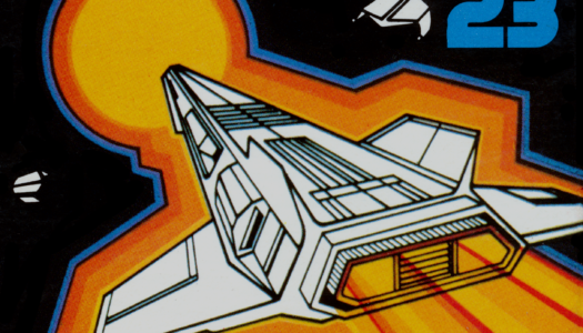
#4 Bodycount

While most shooters opt for a cover featuring their generic white male buzz cut and/or helmeted character, Bodycount decides to focus on the real star: the guns.
But what probably makes this cover stick out the most when set next to other box art (and shooter box art in particular) is the use of white space. Experienced designers realize that white space (or negative space), when used properly, can give an image a very elegant or iconic look that gets people’s attention. Almost every designer at some point experiences having a client who is afraid of white space, believing that the fewer area there is covered in ink, the less they’re getting their money’s worth.
Fortunately, Codemasters had the good taste to not object. Add in an explosion of color that’s slightly more reminiscent of Bob Peak than a dance game, and you’ve got yourself a unique, classic image. If only the same could be said for the game itself.
Incidentally, Bodycount began as a spiritual sequel to Black, which I felt had one of the best-looking covers of that console generation.

#3 Dead Space 2

I wasn’t a big fan of the first Dead Space cover. The first time I saw it, on a shelf full of games, I thought it was just an image of a glove. Is there something special about the glove in the game? It’s only later, when taking a much closer look, that I could see that there are poorly painted human fingers exposed, and the hand has been severed below the wrist. It’s unclear to me if it’s being flung through the air, or if its just floating in space. Regardless, it was a pretty weak image.
Dead Space 2‘s cover, on the other hand, is what Dead Space‘s should have been all along. A close-up, symmetrical image of the “eyes” of the character’s mask. Though for such a symmetrical image, I would have liked if the Visceral Games logo had been centered, rather than being strangely off-balance with two elements on one side and one on the other.
It’s almost abstract in its simplicity, but also iconic. You could almost just have the shape of the “eyes” on a flat field of black, and it’d still look great. But then, I have a thing for minimalistic covers. Speaking of which…
#2 The Elder Scrolls V: Skyrim

Not only do I have a thing for minimalistic covers, but I’m also a sucker for videogame covers that don’t look like videogame covers. What I love about the box art for Skyrim is the same thing I love about the packaging of the Lord Of The Rings Extended Edition DVDs: they look like fancy old books, but aren’t books at all.
If there’s one thing I don’t like about the box art for Skyrim, it’s that it’s too similar to previous installment Oblivion. If a cover just rehashes another cover, it rarely makes my personal favorite list. What’s different in this case, however, is that Skyrim did it so much better. Just as long as they make sure to do something different next time, because I don’t think they can improve on the concept any further beyond this.
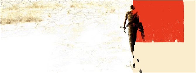
#1 Rage

For those counting, this marks the third Bethesda title in the list, and the second in the top two. Best-looking publisher of the year?
One of my favorite things to see in any sort of poster or cover image is when the title is incorporated in such a way that it appears to exist within the image. While Rage‘s Eisner-esque attempt might not be quite as strong as I think it could be, they score points with me for even doing it.
But the logo is maybe the weakest aspect of the image. What really makes this cover special is how the logo and the background surrounding it exist only within the top half of the cover, the bottom half fading to stark white nothingness, putting all the focus on the isolated character standing at the bottom. It’s a cover that say “epic adventure,” even if many reviewers felt the game didn’t quite live up to expectations. But what game could measure up to an image like this?
My one nitpick is that I think the “From The Creators Of…” blurb could have been a little smaller. Having it there does help contribute to a sense of “this game must be pretty epic,” but it seems a little unbalanced right now to me, taking too much attention away from the character.
Honorable Mention: The Next Big Thing

As I previously mentioned, I’m a big fan of covers that integrate the logo into the art. In this case, the logo is actually part of a billboard behind the main characters, who are leaning up against a classic car that helps set the period the game is based on. The male character could easily be guessed to be a secret agent, though the female character is a little trickier (she’s a journalist).
I think this cover is really strong, except for one thing: the logo is off-center, and it’s driving me crazy. I think pushing the image on the billboard to the left a bit would’ve worked a lot better, not just to center the logo, but also to place “Uncle Sam” closer to the edge. That way you’d notice him if you were looking more closely, but he’s not going to draw unnecessarily attention to himself like he is right now. His being so prominent could too easily confuse people into thinking this is a game about the two characters running for office.

Honorable Mention: World Of Tanks


Two different covers, both with slight problems. I love the core image of the formation of tanks, blowing through some sort of wall that used to be the game’s cover. The cover on the left looks nice other than that I would’ve put the “PC” logo on the right side and the publisher logo in the middle, in order to balance things. Also, I kind of want to see the logo moved down away from the hole in the wall, so it looks less like it’s hovering and more actually attached to the surface.
The second version of the cover (which I believe is now the standard version?) adds a great deal more clutter around the logo, and moves the whole image up so that the front tank is no longer centered, all of which I think was a mistake. But the core idea of the image is fantastic, just requiring some tweaking and balancing.
Plus, I like explosions. There, I said it.
Special Category: Sports

In the Worst Of article, I pointed out how sports games all seem to try and look just like one another, resulting in nothing really sticking out. However, there were a couple that did get my attention.

Using texture to convey movement was really popular with sports covers this year. MLB 11: The Show has a really nice background texture, but in this case its actually an image of the stitches on a baseball that provide sort of a sense of movement. The color scheme is really nice, too. I think going for textured off-white rather than pure white went a long way towards making the cover not blend in with all the others.

Then there’s this. It’s not the tightest cover—the logos at the bottom are a little distracting, and the logo could use some refinement—but I love the overall composition. Sure, it looks a little like a magazine ad for shoes or something, but I think that works for it. It breaks away from the pack by going for a nighttime setting with epic lighting, and every time I look at the lighting rig in the upper left corner I can hear Cake’s “The Distance” playing in my head. I have no idea who Jonah Lomu is, but I’m certain he’s going the distance.
Special Category: Racing

I felt the cover of NASCAR Unleashed deserved a special mention, because it achieves the surprising feat of making NASCAR racing look exciting. It makes me want to go play San Francisco Rush.
And that is why I will never play NASCAR Unleashed—because I know I’d only be disappointed.
Special Category: Japanese Box Art Looks Better

It’s not uncommon for Japanese box art to feature different covers that…well, look nicer. This year’s winner in my opinion is Legend Of Zelda: Ocarina Of Time 3D, which features a beautiful painted landscape that just screams “adventure!”

Meanwhile, the US received yet another bland gold cover. After the original NES game was an unexpected success with its gold cover (and cartridge), Nintendo stayed with the gold theme here, partly out of tradition and partly out of superstition. Unfortunately, its gotten to the point now where the Zelda covers all start to look too much alike.
Special Category: Special Editions Look Better

In the Worst Of article, I was pretty hard on the standard edition cover of Dead Island. I think the moody Special Edition cover is far superior, due to it actually getting across a creepy vibe, not to mention a better color scheme, and that it does a much better job of showcasing the fantastic logo. Even if I’m a little confused as to why the reflection in the water doesn’t match what’s on top…
But even Japan though this cover was better, going with a variation of it for their regular edition. The reflection still doesn’t match, but somehow that only makes this version seem that much more unsettling.

Special Category: Semi-Sequels Look Better

I was also pretty hard on the cover of Marvel Vs. Capcom 3. For Ultimate Marvel Vs. Capcom 3, they had Shinkiro design a proper cover. I would’ve loved to have put it in my top ten, if only that logo wasn’t still such a mess. Also, why is Hawkeye sticking out of Ghost Rider’s forehead? The composition is so strong otherwise, that it make me wonder if he was asked to add Hawkeye after-the-fact, and did the best he could. Though I could be wrong, of course.
Special Category: Could Have Been A Contender

Wow, that’s…a lot of logos. It doesn’t even look like there was an attempt made to arrange the ones along the bottom in an eye-pleasing way, they’re just kind of…thrown in there.
The thing about the cover for Resistance 3 is that, at first glance, it appears to be a simple case of a striking cover ruined by “Playstation Move! 3D Compatible! Playstation Network!” However, if you open the box up, you’ll discover there’s a separate design printed on the back side…

This can be flipped around for you to use as the “real” cover, if you so desire. Though without the ESRB label or the PS3 banner, it doesn’t really feel “official.”
Thing is, there’s an earlier version of this cover was already floating around previous to the game’s release. It makes me wonder if this was the original cover pitched, and feedback from Sony led to it being reworked into something simpler…and in a way, not as interesting.

See, what’s important about having the figure there is that the image becomes a story about a guy walking towards a city in the distance, a city that the skull design hints has been overrun with these creatures. Without the guy there, it’s no longer a story summed up in a single image; its just a painting of a skull with teeth that coincidentally look like a skyline. Skyline teeth that are about to gobble up a bunch of tasty little logos.
The main problem with the version of the cover with the guy, however, is that the PS3 case is so short and squat, the image would’ve had to be dramatically reworked anyways in order for it to really fit well. But I think it could’ve been done.

The only other problem is that people would’ve immediately drawn comparisons to the box art for Rage. Tell me you weren’t already thinking the same thing. But Resistance 3 came out first, so people would’ve accused Rage of being the copycat instead anyways…
(For the record, I firmly believe that neither cover artist ripped off the other—it’s not at all uncommon for artists to come to a similar idea separately, without seeing what the other was developing.)
Special Category: Could Have Been #1

The Skyrim Collector’s Edition is a big giant square box with a beautiful illustration that stretches all the way around it. However, on websites like Amazon, the placeholder image was this small section of the artwork placed inside a rectangle the shape of a standard videogame case.
And yet, the result looks so unlike any other videogame box art out there right now, I kind of wish this was the normal cover. It’s just so…it’s not even just epic, it’s majestic.
Even better, imagine if the book-style art was printed on a slipcover, which you pulled off to reveal this other cover underneath…

This would’ve been not just my favorite box art of the year, but possibly my favorite box art of the last decade.


December 29, 2011
It wasn’t just Elder Scrolls IV: Oblivion that had that ‘old book cover’ style of boxart, but TES III: Morrowind had it too – I think they’d be wrong to change it for the next installment. The titles in the series since III have all had similarly themed covers and I think it makes them stand out and be instantly recognizable as an Elder Scrolls game.
December 29, 2011
Some of these were terrible and you should feel bad for choosing them. Hunted, Space Marine, and Halo don’t deserve to be in the top 10. Rage is good, but doesn’t deserve #1. The Next Big Thing, World of Tanks, NASCAR, and that rugby game are hideous. Next time you do this, put in a little effort and do a little research. The evidence of any actual effort is non-existent. Maybe you should pass the honor of writing this article onto someone that actually knows something about graphic design, art, and what the average person finds visually appealing.
December 30, 2011
What about visual appeal has very much of anything to do with objectivity in any form of art, or petty, I’ll-defined adjectives like “good” and “bad”? Your whole “arguement” is a weak, subjective attempt to subsume this writer’s authority in list-making, and a gratuitous wank off to your own tastes, which you never even describe (likely because you fear your same critique here could be used against you). Aside from that, next time you comment, put a little effort and research into it.