What does it do well, and what could it do better?
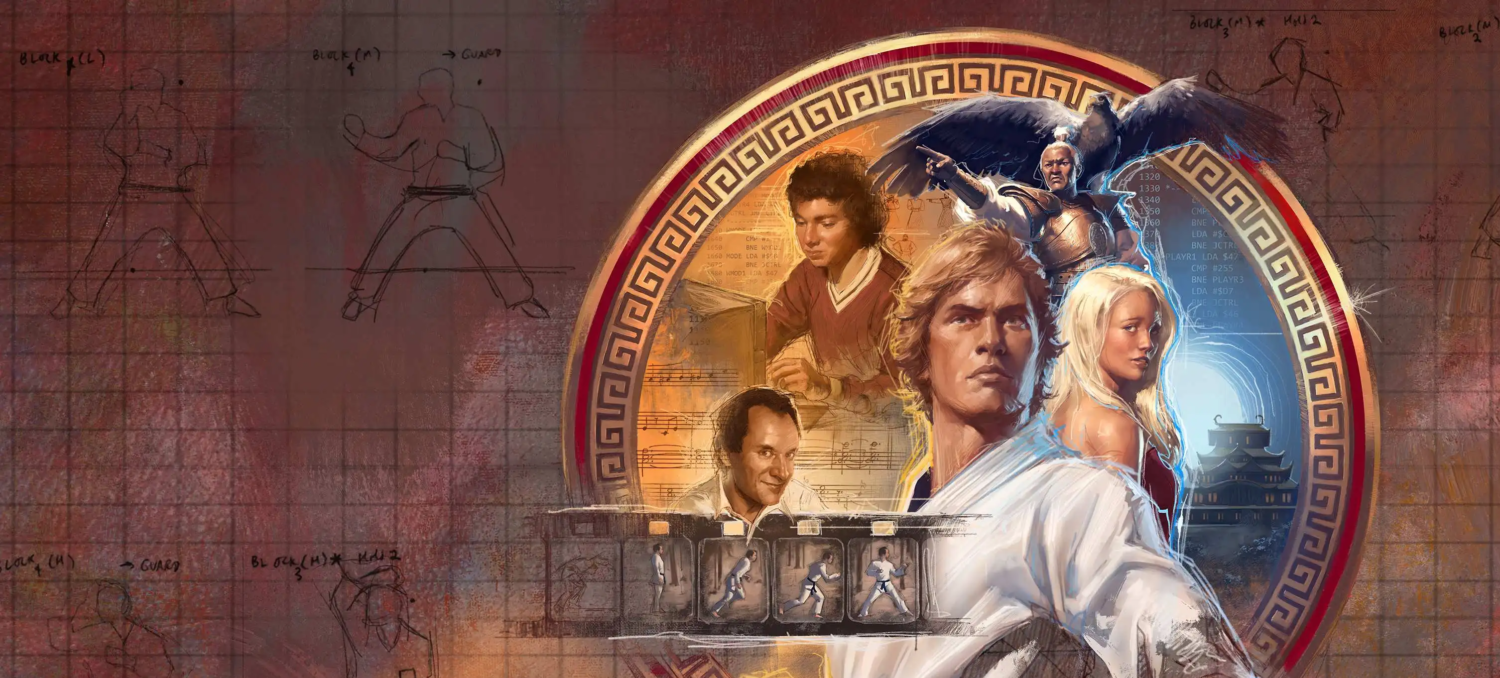
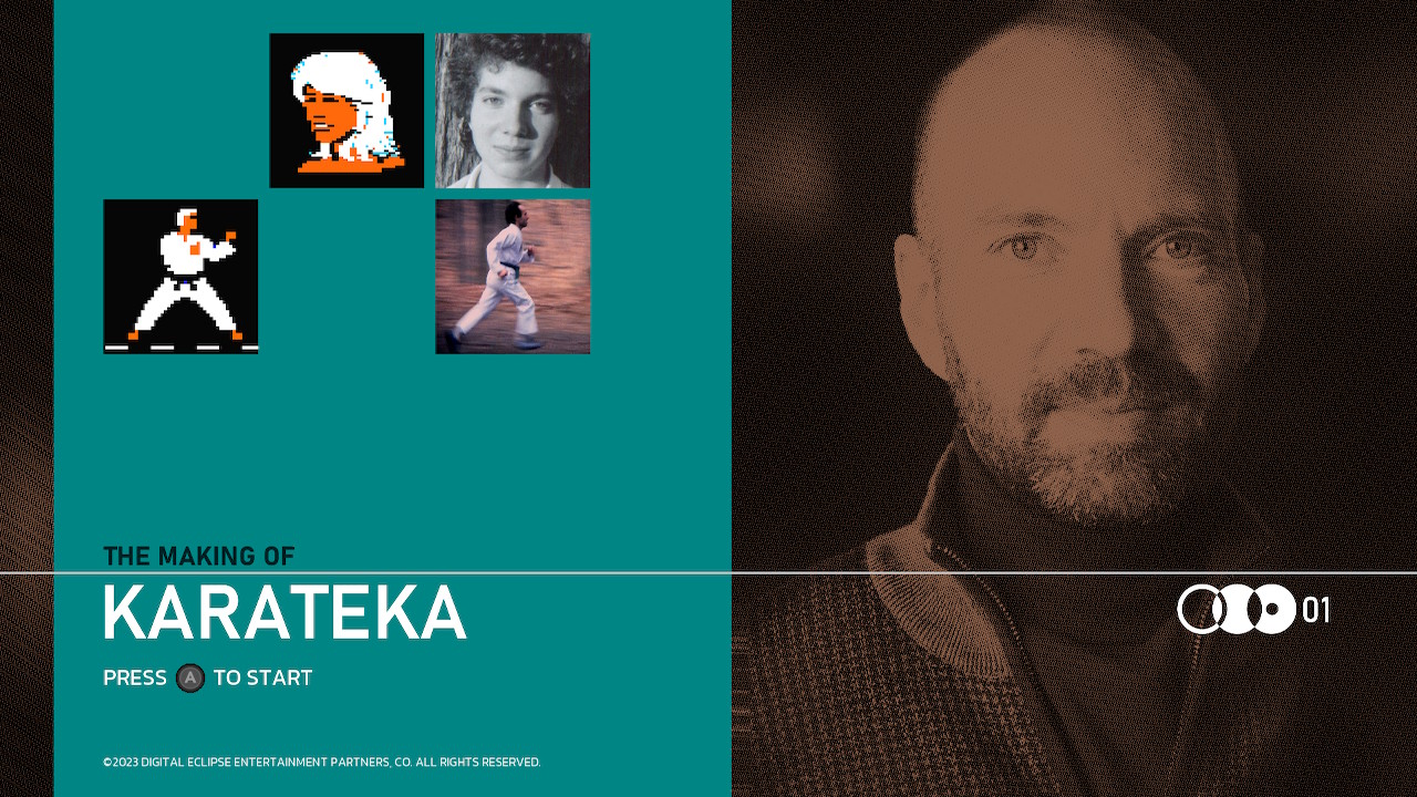
Last Summer, game developer Digital Eclipse released The Making Of Karateka, a cross between a documentary, an artbook, a museum gallery, and a game collection, that details the story of the game Jordan Mechner created before Prince Of Persia.
It’s the first installment in what Digital Eclipse is calling their Gold Master Series, which looks to be the gaming equivalent of the Criterion Collection. For those of you who aren’t film buffs, the Criterion Collection is a highly regarded and long running series that began rereleasing acclaimed films loaded with additional bonus content and special features before anyone else was doing it.
But what makes the Gold Master Series different is that rather than the historical and behind-the-scenes content being supplemental material to the main attraction, here that material is the main attraction. It’s a creative solution to the problem of getting people interested in the history of the medium when games don’t age quite as well as film, on account of games not only having to deal with aging visual techniques but also aging gameplay.
Digital Eclipse are calling the approach an “interactive documentary,” a format they first debuted with Atari 50. But where that still felt a bit like a game collection with a supplementary artbook, it’s The Making Of Karateka that finally feels like an artbook with supplementary games.
Because this is such an important step in the history of documenting gaming history, I’d like to take a moment to discuss everything I love about this, while also suggesting a few improvements I’d like to see in future installments of the Gold Master Series — or in the interactive artbooks of anyone else who decides to embrace this new format.
What It Does Well
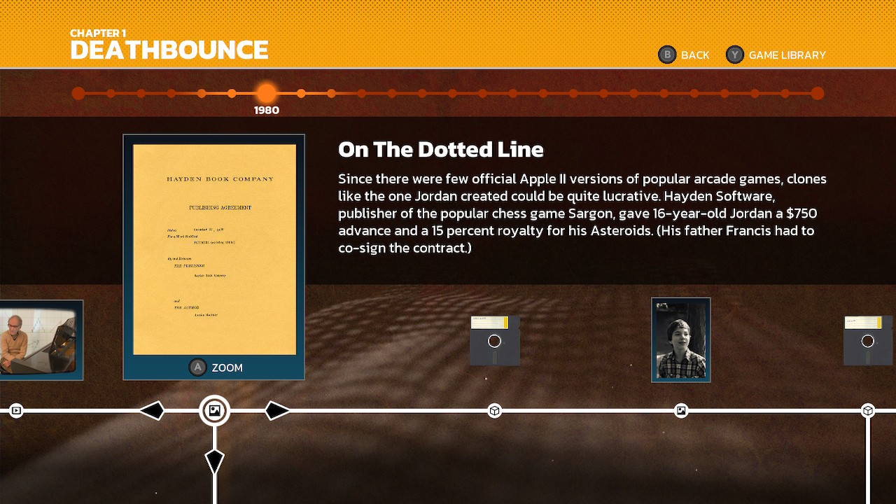
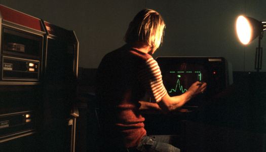
The story of The Making Of Karateka is told via variety of documents: production art, correspondence, photographs, interviews, and commentary tracks, as well as the game itself, plus select ports and prototypes.
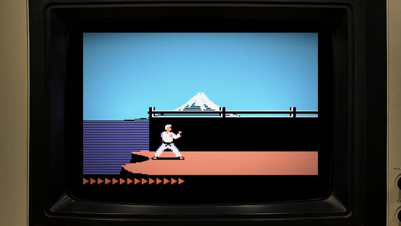
The inclusion of prototypes is especially notable. Not only does the timeline include multiple pre-final versions of Karateka itself, it also includes several canceled games Mechner was working on immediately prior. All the games include save states, scans of the original instruction manuals (where applicable), and a screen filter and border that replicates playing it on the original hardware.
But one of my absolute favorite features is the interactive playthroughs, which allow you to watch a recording of the game, and then — through a bit of magic — hop in and start playing at any point. This is a feature that’s appeared several previous Digital Eclipse collections, but was sadly missing from Atari 50. In The Making Of Karateka, the only games that don’t include this option are the two “new” games:
- Deathbounce: Rebounded is a reimagining of Mechner’s canceled game with a few new ideas and some added polish.
- Karateka Remastered is a graphical update of the original that adds a few “deleted scenes” back in that were cut for various reasons (as someone who already knew a great deal about the history of this game, I was so excited to finally see the big cat!), plus a Valve-style node-based commentary track explaining the various modifications and additions.
I’ll be honest, I was initially disappointed I couldn’t just watch the game with a commentary track, because Karateka is a challenging game and I didn’t want to struggle through it just to hear everything. But fortunately, Karateka Remastered lets you start with a healthy number of lives, and I was able to just barely make it to the end on my first try (though the placement of one node actually cost me a life, lol). I was ultimately glad it provided an excuse to manually play through it.
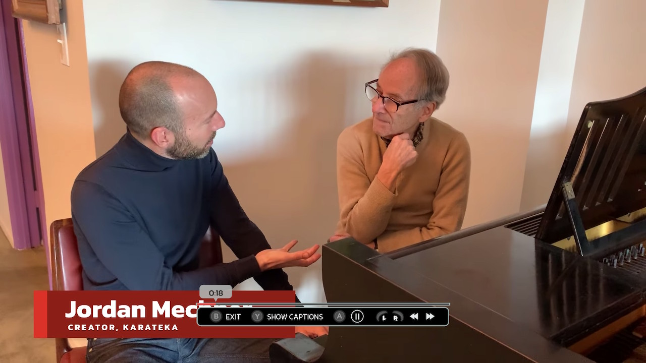
However, the biggest highlight for me was the interview videos, which include Mechner and his father reminiscing about different aspects of the game’s development, plus interviews with various people who worked at Broderbund, the company that published the game.
What It Could Do Better
But despite my gushing, I also see some room for improvement.
Admittedly, the more I love something the more critical I become. When a windshield is freshly clean, suddenly every little flaw sticks out, compared to a windshield caked in mud. So please don’t get the wrong impression just because I’ve used more of my word count on little nitpicks than praise. I simply want nothing more than for this series to be the best it can possibly be.
So here are a few observations from a gaming historian who also happens to be a UI/UX designer.
Kerning
Being a graphic designer, the very first thing that jumped out at me was the bad kerning. I apologize in advance for what I’m about to do to your brain.
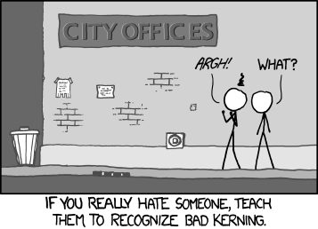
Kerning is the space between individual letters in a word, and bad kerning is when the spacing is noticeably uneven. The average person won’t consciously notice it, but on an unconscious level it can make an otherwise prestigious work feel indescribably somehow less.
Sadly, whoever designed the font used throughout THE MAKING OF K ARA TEK A never optimized the kerning for all-caps use. And now that I’ve pointed out, you will never be able to not see things like “DRA WING FROM LIFE.”
It’s a nice-looking font otherwise, but when the kerning is this bad, your options are either: 1) manually fix each instance in the layout, 2) fix the font file itself using a font editor, or 3) pick a font where the typographer already did #2 for you.
“Unread” Indicators
Update: I’ve since learned that the problem I talk about in this section must’ve been an isolated issue, because although I have a note written to myself from launch day, I see that there are Youtube streams from the same day, on the same platform, where items do get marked as “read” (with a satisfying “pop” effect, even). So you can skip to the next bit, but I’m leaving this in for posterity.
Underneath each chapter header from the chapter selection you’ll notice a percentage labeled “Explored.” This is a fun way to let you know whether you’ve missed anything, but it can also become a burden. Because if you did miss something, it was likely some image buried in some side path off the main timeline that you forgot to click to view in gallery mode.
This somehow happened to me in every single chapter, and the only way to reach 100% at that point is to quickly rush go through the chapter a second time clicking on every single item. Which isn’t particularly fun or satisfying, just tedious.
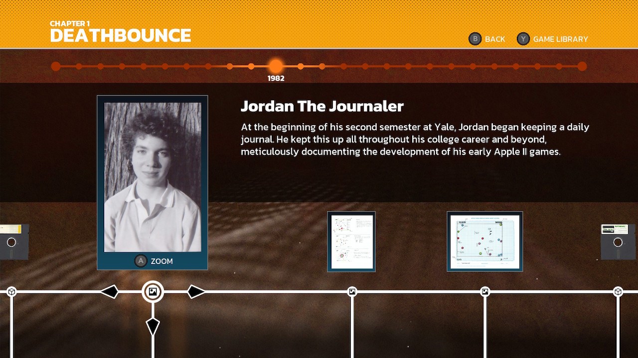
But this could easily be turned into a positive experience. All it would take is some visual cue to indicate which items are “unread.” It could be as simple as just making the circle icon on a timeline empty by default, and filled in once you’ve viewed it. Or even better, it could go from being white to being the chapter’s designated color (orange in the screenshot above).
Now instead of the completion percentage feeling like it’s making you do extra work, it’s more of a helpful reminder that you might’ve missed something. Hey, here’s an item where maybe you should pause for a moment to take a closer look.
Not only that, the indicator would double as an effective “bookmark” for anyone who has to stop mid-chapter and come back later. Instead of feeling like the worst kind of gamification, it becomes the best kind.
Action Button Consistency & Emphasizing Instructions
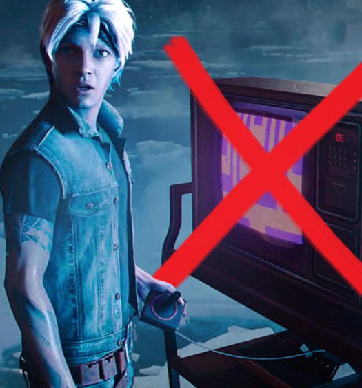
One thing that kept throwing me off is that the timeline wanted me to press “A” to interact with everything, except games. (Note that I was exploring this on Nintendo Switch, so your corresponding action button might be different.)
View an image? Press “A.” Watch a movie? Press “A.” Play a game? Press…”X.”
I understand the reason for this. Each game is also tied to a scan of its box art or disk, and the idea is that you press “A” to view the scan in gallery mode and thus you need to press a different button to play the game. But because I was so used to pressing “A” for everything, without fail I would press “A” whenever I wanted to play a game, then have to go back and press “X.” Every single time.
But here’s the thing. Pressing “X” takes me to a sub-menu, because most of the games have an option to either “Play Game” or “Watch.” What if pressing “A” brought me here instead, and the options to “View Box” and/or “View Disk” were included on the same page?
While we’re at it, I’d also include an option to “View instructions.” This is even more important than viewing the box or disk, because otherwise the instructions are hidden inside the in-game options, and people who aren’t used to playing old game don’t realize how important it was to read the instructions. The average person just goes “I can’t figure out what’s happening, so clearly this is a bad game.” If we want people to develop an appreciation for old games, we really need to make the instructions as easy to find as possible. Please, please, let’s normalize reading the instructions for old games.
And I know this sub-menu is filling up fast and I keep requesting things, but this last thing is also so important: If the game has a commentary track, please include “Watch With Commentary” or “Play Game With Commentary.” I never would’ve realized the Apple II version of Karateka had a commentary track at all if someone on the team hadn’t told me on Twitter in response to something only tangentially related. I worry how many other people out there still don’t know.
Rotoscope Theater
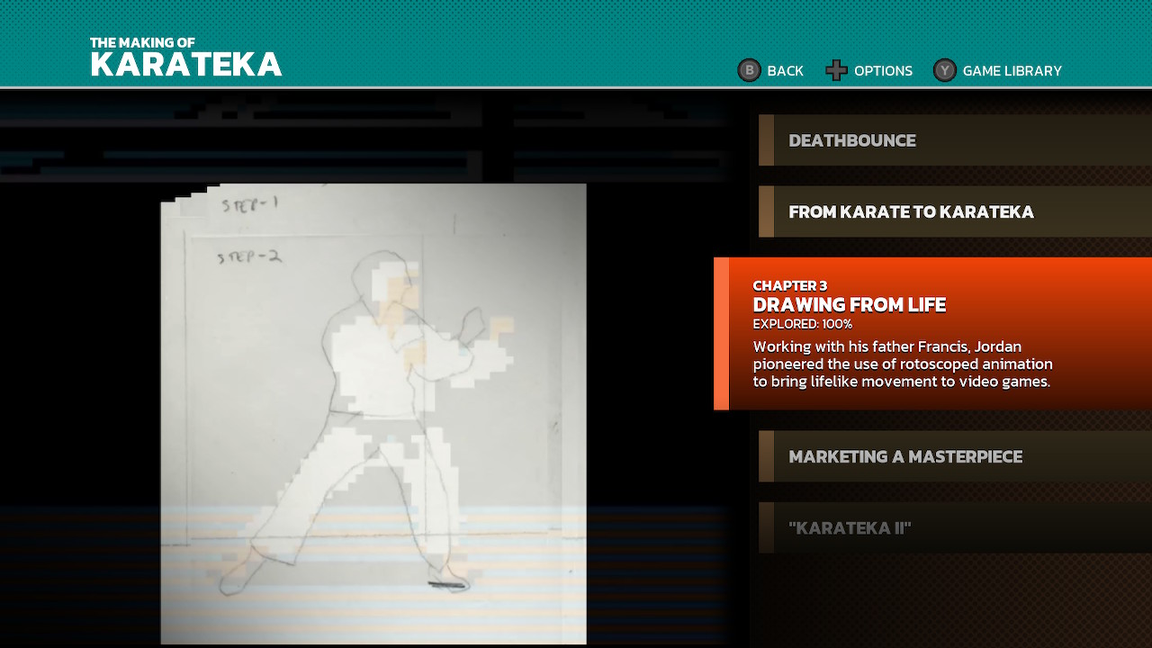
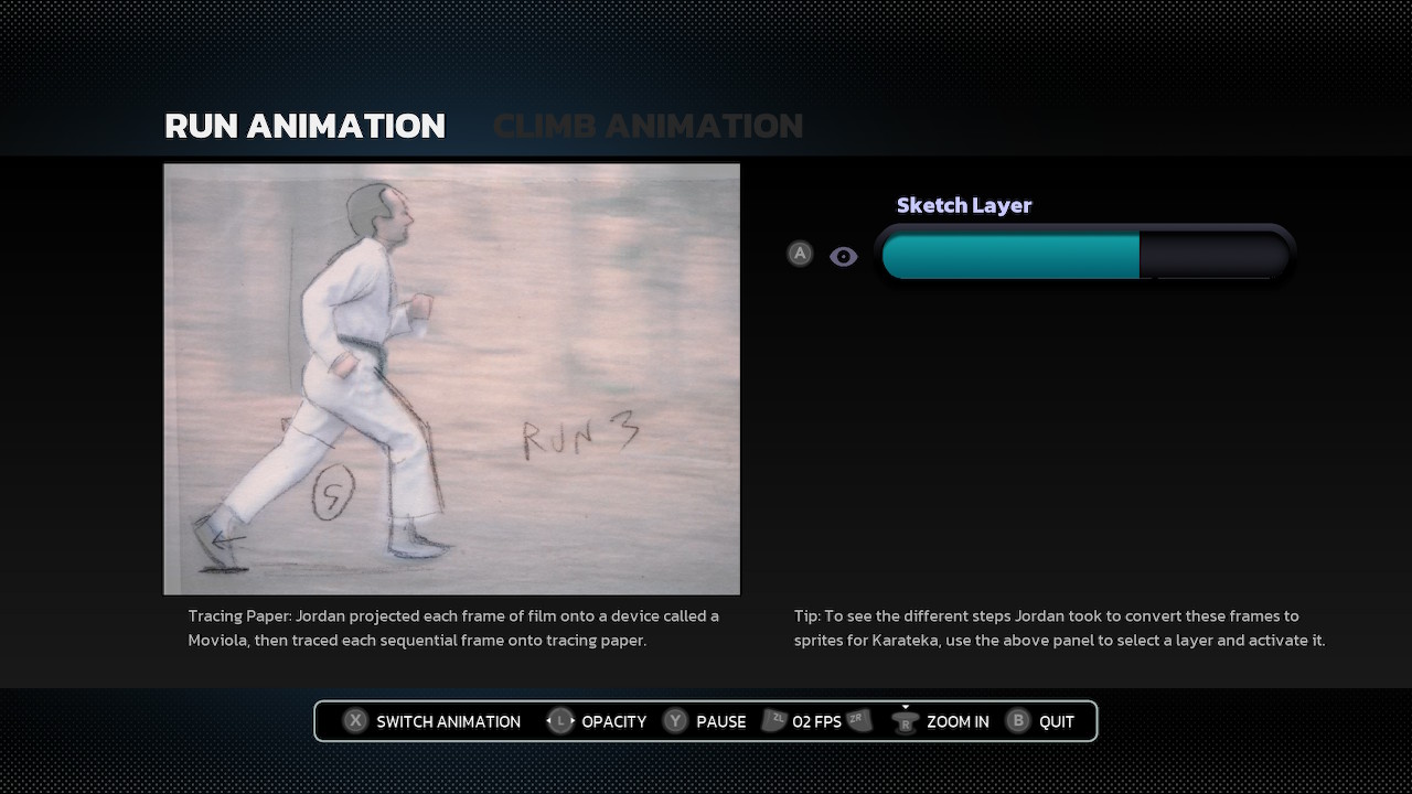
The character sprites in Karateka were created by Mechner first filming his father doing the action, then tracing frames onto paper, then tracing those illustrations into an art program and cleaning up the pixels. This process is called rotoscoping, and a very cool unique feature created for this volume is a “Rotoscope Theater” that lets you compare the different phases of the process.
Unfortunately, I feel like the specialness of this feature is hurt slightly by how its embedded into the timeline. The first time encountered it, it only had a single slider, comparing the film to the sketch layer. I wondered, “Why isn’t it letting me also compare it to the final sprites? How do I turn that on?”
It turns out the Rotoscope Theater appears three times in the timeline, each time with an additional layer present. Maybe this was done to not overwhelm people? But the result is that the first appearance felt underwhelming, and the final appearance lacked the “Wow!” factor I would’ve felt if I’d seen it all at once.
Personally, I would’ve liked to have seen a video demonstration directly preceding the Rotoscope Theater. But not a demonstration like “If you do this, this happens.” It could’ve been a covert demonstration disguised as documentary, with a narrator telling us the story behind each layer while showing it to us. And then at the very end, saying: “And you can go into the Rotoscope Theater and play with it yourself!”
That would make me go, “Oh wow, this is a tool I can use myself?!” Plus, it’d simultaneously fix several other issues:
- The caption and tip text is so tiny that I didn’t notice it at first (because it looks like “disclaimer” text), and even when I did notice it I didn’t want to read. Having a narrator say those things would make that text unnecessary.
- Being a UI/UX designer, I know better than most that “intuitive controls” really just means “similar to something I’ve used before.” But because this feature is so new and unique, it’s unlikely most people will have used anything similar to it, which means it’s doomed to feel unintuitive no matter what. A video demonstrating it being used would immediately fix that.
And once people are used to it, can this concept be used for other things? What if you could watch an entire playthrough of a game while using the sliders to compare the graphics in different ports? Have you seen the Youtube channels out there that do side-by-side comparisons of ports? They’re so fun, and being able to overlap them could possibly be more fun.
Documentary Mode
On the topic of “intuitive controls,” I do have a minor nitpick about the video controls. Most video controls prioritize “Play/Pause,” “Skip Forward/Back,” “Captions,” and “Exit” in that order. It feels super weird and “unintuitive” that the Gold Master controls are almost entirely reversed in that regard.
I also noticed a weird quirk where I can’t skip forward/back while a video is paused, only when it’s playing. What makes this quirk doubly weird is that you can skip forward/back when interactive gameplay is paused, just not videos.
I could suggest other little improvements, like it’d be great if I could use the thumbstick to scan/scrub through the video timeline instead of just skipping in 5 second increments, but that’s a minor thing. What I’d really like to suggest is an additional way to navigate videos:
From the timeline view, pressing “Y” takes me to a “Game Library” that displays all the games in one place. I can’t tell you how much I’d love a similar “Video Library,” with all the video clips. Especially if it included the ability to “Play All,” so I could watch all the clips back-to-back like a documentary.
In fact, if the clips in future volumes were edited so that they felt like a complete documentary when strung together, I think there are people out there who’d be more willing to buy a documentary that includes the games its about than a game collection that includes a documentary? Or maybe that’s just me. It could just be me.
Either way, there’s one last feature that I felt is sorely missing from The Making Of Karateka:
The Opening Hook
Every good documentary starts with an opening hook — the initial declaration of why this subject is important, and why casual viewer should want to know more. I feel like the introductory video doesn’t quite hit the mark, for two reasons.
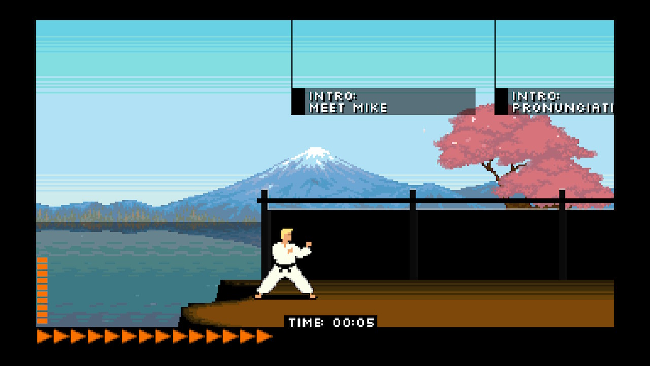
First, it’s couched in the very beginning of “Chapter 1: Deathbounce” when the Intro video should maybe be a chapter all its own, listed right on the top-level menu. Actually, the very first time I loaded this up, the first thing I did at chapter select was press “up” several times, because I thought “The Making Of A Masterpiece” was the intro chapter.
Part of that is the headline being the same size and style as the chapter titles, which looks confusing. But the other part is just…I wanted to watch an intro to set the stage before I dug into Deathbounce, y’know? I think a top-level Intro chapter would make a better on-ramp for a casual fan as well.

As I said, I already know all about the history and importance of Karateka, because of research I’ve done on the publisher Broderbund. But before I did that research? I’d never heard of the game. And when I quiz people who grew up with the NES or later, or who grew up with computers starting with Doom or later, they typically also have never heard of the game. Like so many ‘80s computer games, it’s become obscure.
They’ve heard of Prince Of Persia, of course! That’s the obvious hook to getting someone interested in hearing about Karateka. And I think that’s the other problem with the current introduction video: it doesn’t mention Prince Of Persia. In fact, unless I’ve simply forgotten, The Making Of Karateka doesn’t mention Prince Of Persia anywhere until the very end of the final chapter. I want more people to learn about these old games, but it really needs that Prince Of Persia opening hook.
And from there, shock viewers into wondering why they’ve never heard of such an important mega-hit game by leaning into just how huge it was. Because this wasn’t some obscure, little known game that gave the Prince Of Persia creator his start. This game sold in significant numbers for the time. Having other developers say they enjoyed it helps, but still doesn’t get across that this was a Billboard #1 hit.
Now, you might say: Is someone really going to buy this without already being hooked on the idea? And the answer is: surprisingly, YES!
Fans of the Criterion Collection will often buy those releases knowing very little going in, using them as a way to learn about important old films. And like the Gold Master Series, they’re numbered to encourage people to “collect them all.”
In fact, if I wasn’t dangerously low on funds, I would have already purchased Gold Master #02 –Llamasoft: The Jeff Minter Story — despite knowing less than nothing about those games —because it seems like a fun way to learn about those games. But at least give me an opening hook to tell me what’s up.
You might also say: Doesn’t the trailer act as the hook? That’s true to an extent. It even makes a point to mention Prince Of Persia. But again, people who buy Criterion Collection releases aren’t watching trailers for them. Watching a trailer should not be a requirement.
I would’ve liked to have seen some of the excitement from this trailer edited into the beginning of the Intro video, because opening the Intro with a guy holding a box of disks saying “this is a MediaMate” is…well, it’s pretty low energy. And not a hook. The Billboard #1 hit before Prince Of Persia is the hook.
But I say this with love! Because my hope is that if we can get enough people interested in these releases, that this series will end up lasting at least as long as the Criterion Collection — which started 40 years ago this year, and is still going strong.
Do you agree or disagree? Let me know in the comments on Patreon.
You Might Also Like


