Before the NES, before the Atari 2600…
Fairchild’s Channel F was the first video game console to run games directly from a cartridge. While Magnavox’s Odyssey had game cards that resembled cartridges (see part one), the cards merely activated game logic from inside the console itself.
But very few people ever saw Odyssey’s additional games or their corresponding boxes. And in an era when most people still didn’t own a VCR, the idea of inserting a video game into a game player was a radical one. Fairchild industrial designer Nick Talesfore realized that the best way to ease consumers into a new concept was to wrap it in something that already felt familiar.
So he designed the Channel F console to look like a piece of stereo equipment — complete with wood grain paneling — and based the game cartridges on 8-track cartridges.
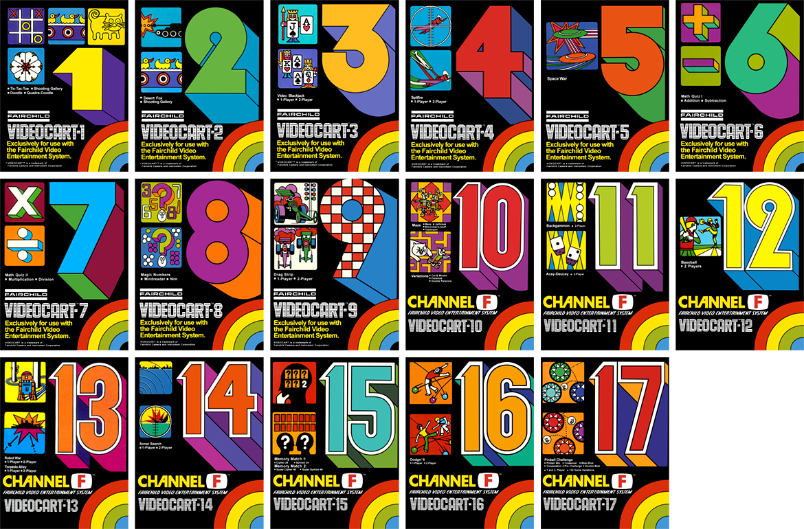
Yet he also wanted the cartridges to look fun and unique, so he made them bright yellow and gave them colorful labels with giant numbers. The idea behind numbering the games was so that when a consumer saw one, they’d know there were more.
The label graphics were illustrated by Tom Kamifuji, a Bay Area artist who Talesfore remembered from his previous job at Novus. At a time when illustration was in higher demand than photography, Kamifuji spent decades doing commercial illustration for high profile companies.
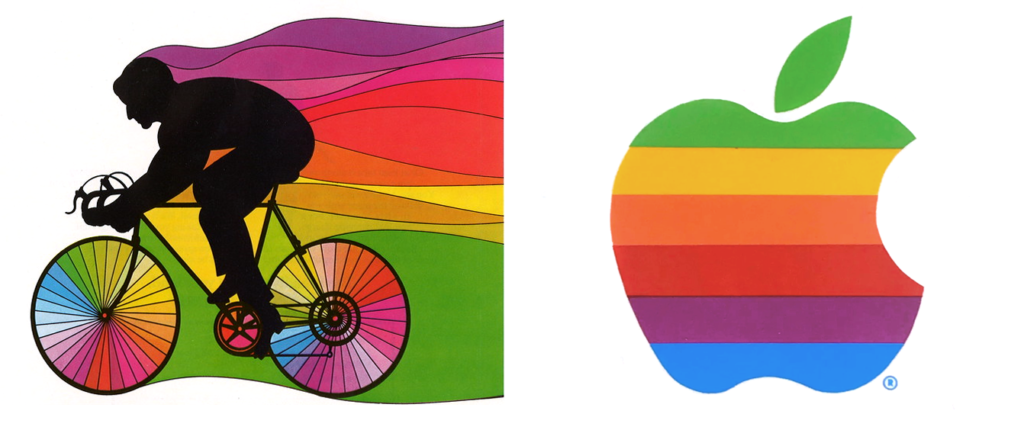
He even inspired the original rainbow Apple logo, according to Regis McKenna, whose firm created it in 1976. Although McKenna wasn’t any more specific than that, I suspect the firm was looking at Kamifuji’s “See The Light” illustration — created for 7UP in 1973 — when they chose the unique out-of-sequence colors for Apple’s logo.
Meanwhile, Fairchild’s game console was getting a clever new rainbow of its own.
The Box Template
Fairchild’s box art reused the label art with a small addition: a rainbow that wraps around the lower right corner. From the front of the box it continues through the right side onto the back, then down to the bottom flap where it meets back around on the front. It reminds me of the “circular” LP artwork for Pink Floyd’s Dark Side Of The Moon.
But do you notice anything missing the game box? An important key detail?
Nowhere on the box will you find the phrase “Channel F.”
That’s because the console was originally branded as the Fairchild Video Entertainment System (VES). Several legends around why they changed the name, but the true story is pretty straightforward: it’s all Sears’ fault.
Fairchild was talking to Sears about getting the VES stocked in their stores. But at the time, Sears liked to rebrand products with their own internal branding.
For example, if you bought Atari Pong at Sears, it was branded “Tele-Games Pong.” When Atari introduced their Video Computer System (VCS), later called the Atari 2600, Sears rebranded it the “Tele-Games Video Arcade.”
According to Talesfore, a Sears marketer whose name has been lost to time proposed the name “Channel F” (for “Fun”). When the deal with Sears fell through, Fairchild liked it so much that they decided to rebrand.
And who can blame them? “Fairchild Video Entertainment System” is a pretty stuffy name. But then, Nintendo Of America had a great deal of success using almost the same exact name, so who knows?
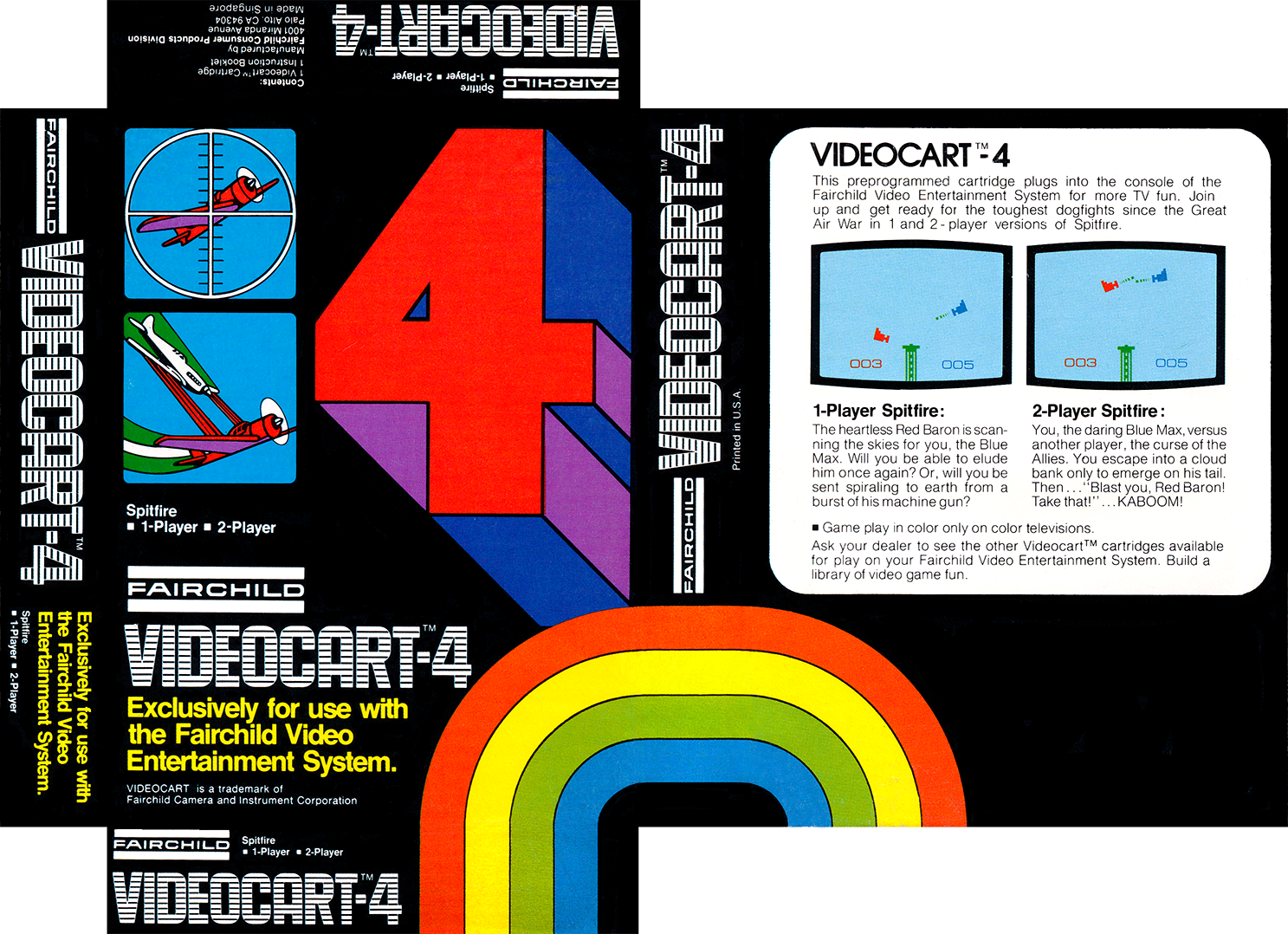
The “Channel F” rollout was a gradual one, first appearing on labels during the summer of 1977. These redesigned labels also added game rules and instructions, I assume because some people were treating the game cartridges like 8-tracks, storing them in a rack and throwing out the boxes.
Each year the labels were printed with fewer and fewer ink colors to cut costs. What made the labels look so vibrant is that they were printed using spot colors instead of the typical four-color process.
“Four-color process” uses four specific colors — cyan, magenta, yellow, and black (“CMYK”) — to create a wide variety of colors using dot patterns called screentones.
“Spot colors,” on the other hand, are custom colors mixed in advance and printed “flat” without dot patterns. If you use more than four spot colors it’s going to be more expensive than CMYK. But if you use only two spot colors, it might be cheaper. The original labels often used more than four.
But the box art, as far as I can tell, was always printed in CMYK. This might be due to the screenshots on back, which were probably easier to print that way.
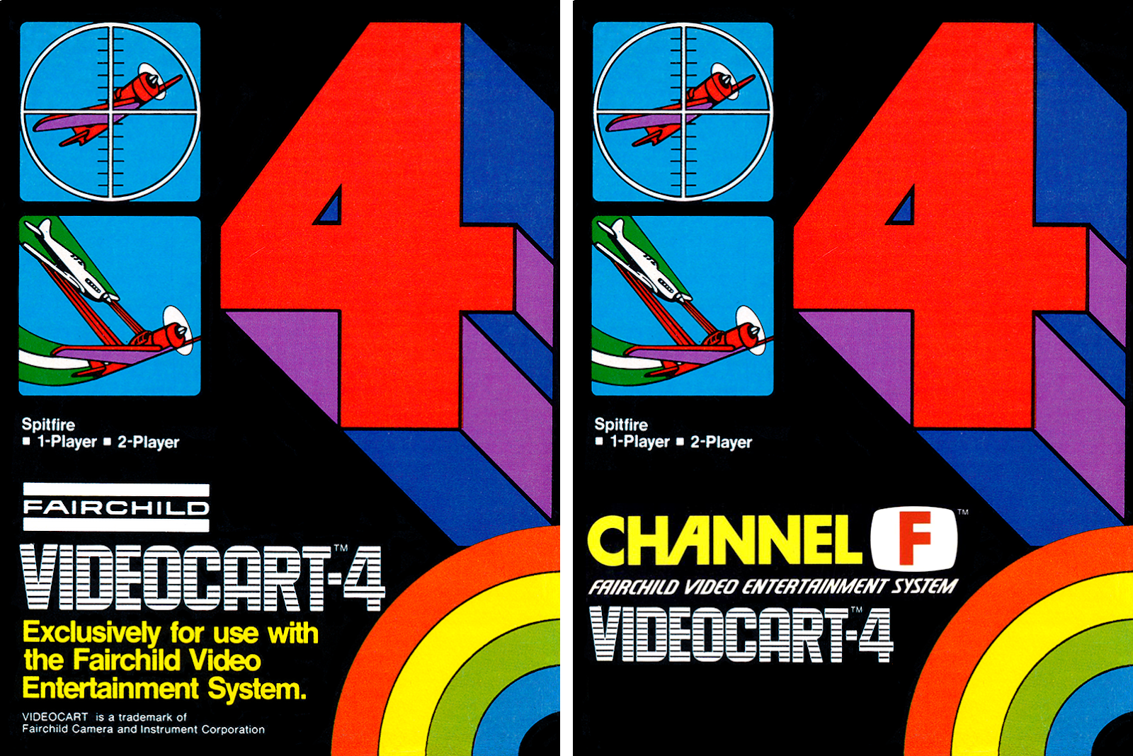
The “Channel F” rebranding wasn’t as quite as dramatic for the boxes. It basically just involved adding some words and removing some words.
Yet for some reason there was a delay between the new labels and the new boxes. Games that were released during the summer of 1977 said “Channel F” on the labels, but were still packaged in Fairchild VES boxes. Maybe they printed up the boxes much further in advance?
Most of the box copy is set in Helvetica. The game title on back is in Avant Garde, as is the “Channel F” logo itself, with the “C” modified to look like Futura and a custom “A.” An alternate version of the logo (seen earlier in this article) appeared on brochures and used a different custom “C.”
The text below the logo feels really familiar, but either the font hasn’t been digitized, or it was made custom. The “Videocart” font might also be custom, but let me know if you spot it somewhere.
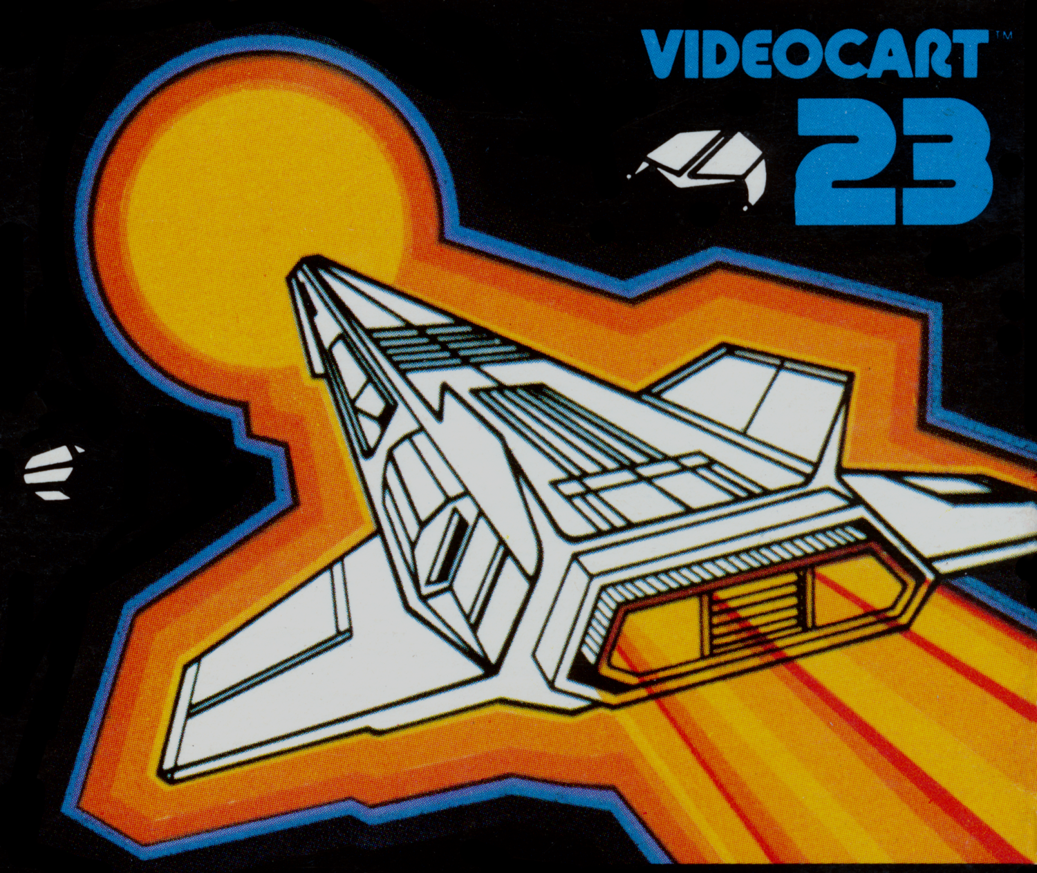
The 1978 Redesign
Fairchild was feeling pretty good about the Channel F heading into Christmas 1978. They were about the launch the Channel F’s first major ad campaign, which would include magazine ads and a television commercial starring Milton Berle.
That summer at the Consumer Electronic Show, they unveiled an improved hardware revision dubbed the Channel F System II. They also announced seven new games, and a mini-keyboard accessory. The Channel F’s subtitle was also changed to “Fairchild Video Entertainment Computer.”
The box art was also given a redesign. But for reasons not entirely clear, four of the seven games never shipped (including three that were designed to use the mini-keyboard), and the mini-keyboard accessory went MIA.
Although Nick Talesfore still around to design the revised System II console, he wasn’t involved in designing the new box art. It may’ve been handled by Peter Chope & Associates, the firm that designed the Channel F’s other print materials, but unfortunately Peter Chope passed away in 2013.
The artist also remains unknown. While it looks kind of Kamifuji-esque, Talesfore says Kamifuji wasn’t involved either.
I think the new look was a reaction to the game boxes released by Atari and Sears for the Atari VCS, which launched for Christmas 1977.
Like the Channel F, Atari’s early VCS games were collections of multiple games or game modes. But instead of numbering each collection within a series of “Videocarts,” Atari gave each collection its own catchy title, like Air-Sea Battle.
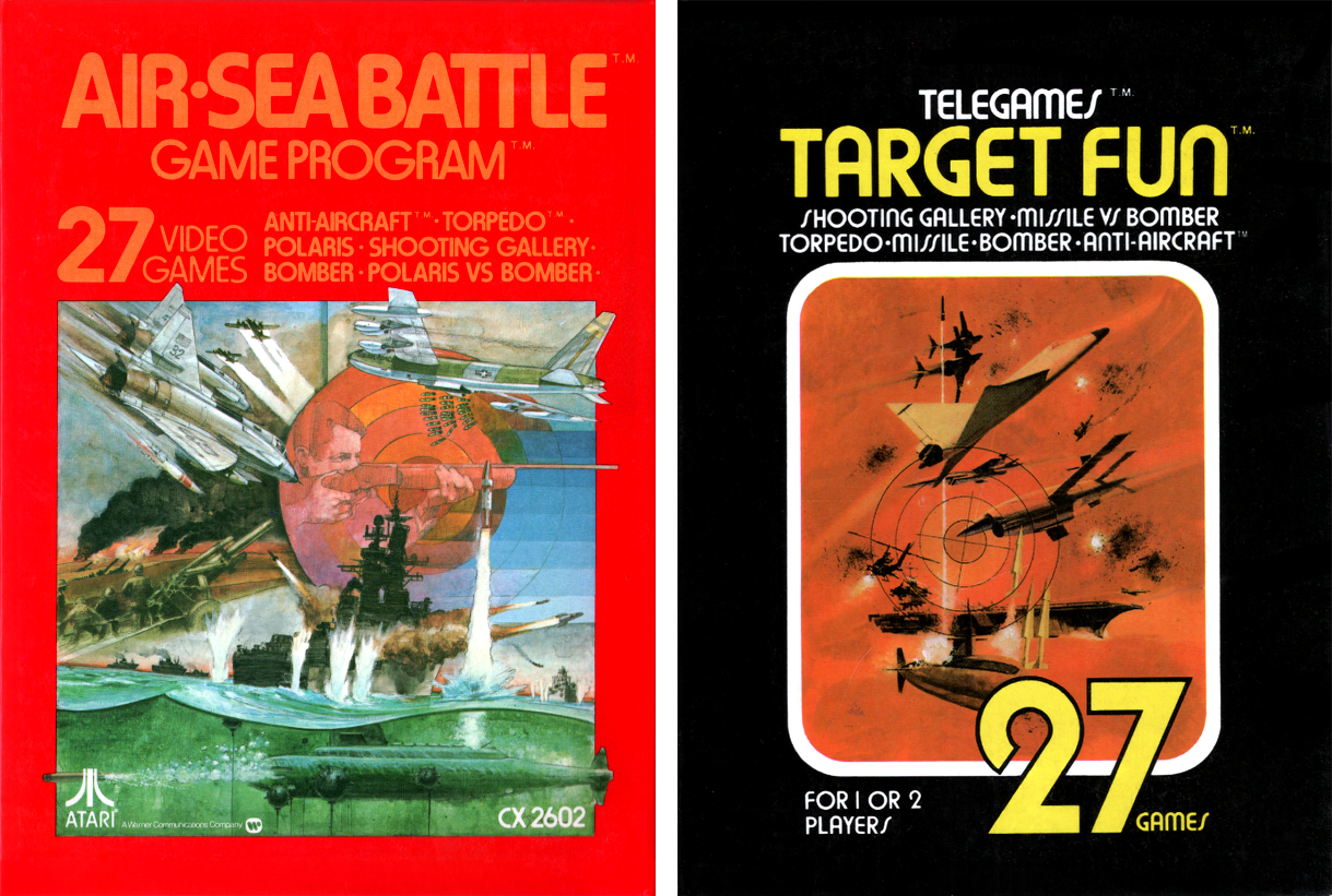
Sears, as usual, repackaged Atari’s games with their own branding and art. Sometimes they kept Atari’s title, but other times they even changed that. Atari’s Air-Sea Battle became Target Fun. (Could that be the same marketer who suggested “Channel Fun”…?)
Compared to the first Channel F boxes, the Atari boxes and the new Channel F boxes are much more conventional by modern standards. When we look at a game box today, we’re used to the visual hierarchy being:
1) BIG ILLUSTRATION
2) Large Game Title
3) Console Name
4) Publisher
Whereas the first Channel F boxes went:
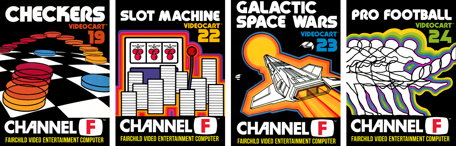
1) GIANT NUMBER
2) Multiple Small Illustrations
3) “Videocart-(Number)”
4) Publisher
5) Console Name
6) game titles in extra small print
This would never fly today, but back then there were no rules. And admittedly, the original run is great at making you feel like you’ve “gotta collect ‘em all.”
So how did the redesign do compared to the original? Well, it’s complicated.
Other departments of Fairchild weren’t doing so well, which was hurting their bottom line. At the beginning of February 1979 they were still planning to operate their video game division at a “reduced level,” but by early April they’d shut it down. The Channel F rights and remaining inventory were sold to a small nearby company called Zircon, founded by former Fairchild employee Chuck Stauss.
The name Zircon reflected Chuck Stauss’ sense of humor. In reference to the famous line from 1933’s Son Of Kong, in which the lead says “stick with me and you’ll be wearing diamonds,” Stuass used to joke to his wife “stick with me and you’ll be wearing zircons,” i.e. cubic zirconias. When he started his own company, he decided that would be the name.
After buying Channel F, Zircon spent the next year just selling off backstock. But then they surprised Channel F owners in Fall 1980 by releasing the final four of the seven games that were announced in 1978!
Then, in another shocking move, Zircon released two brand new games in 1981! But because these final games were only available via mail order, they shipped in plain white boxes without any proper art. Unless you pretend they’re like “The White Album.”
Fairchild and Zircon haven’t been involved in video games since the crash. But where the Fairchild brand disappeared into other acquisitions, Zircon was about to avoid acquisitions altogether and is still going strong, and they just might have video games to thank for that.
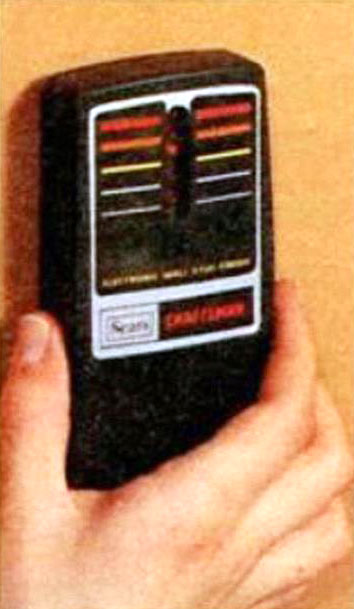
According to Chuck’s son John Stauss, Zircon’s brief time spent manufacturing games and accessories (including variations on the Channel F controller redesigned to be used with other consoles and computers) opened the door to a relationship with Sears. This allowed them to pitch Sears on a revolutionary new product: the electronic StudSensor. Sears rebranded it the Craftsman Stud Finder.
But before we conclude this installment of Box Art History, let’s rank them:
7. Slot Machine
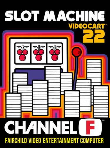
While the colors are nice, this is the only illustration in the final group that lacks any sense of movement. Imagine if those coins were flying out of the machine at us instead of rigidly stacked up.
But the worst part is the kerning in the title (font: Yagi Bold), which was thankfully handled much better on the other games.
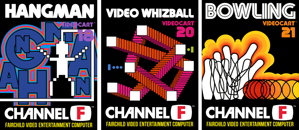
6. Hangman
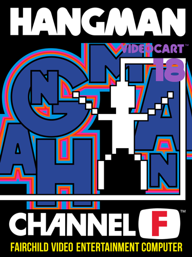
I would be panicking about how to make a game of Hangman seem exciting, but the artist did a pretty alright job. The only problem is how claustrophobic the final art is, with the words “Videocart-18” being barely readable.
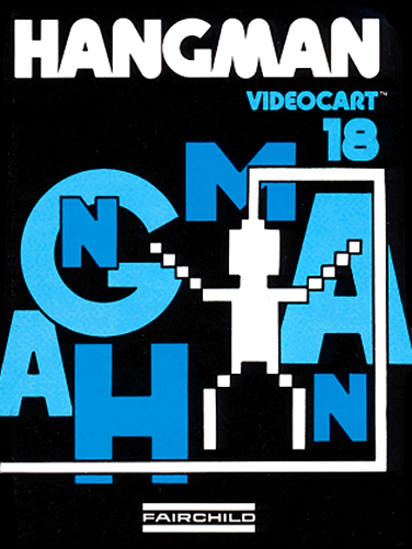
I think the cover to the manual (at right) shows what the artist originally intended. “Videocart-18” sites nicely between the title and the top bar of the gallows. Unfortunately, it left no room for the large Channel F logo.
5. Video Whizball
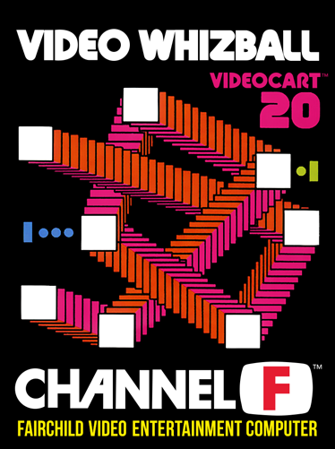
Did the Channel F predict the ending to MS Solitaire?
This illustration makes a lot more sense once you’ve seen the game in action, but the artist clearly struggled to convey the unique gameplay, which plays a lot like the tabletop game Crossfire (a.k.a. the most ‘90s game to ever exist in the ‘70s).
4. Videocart-9
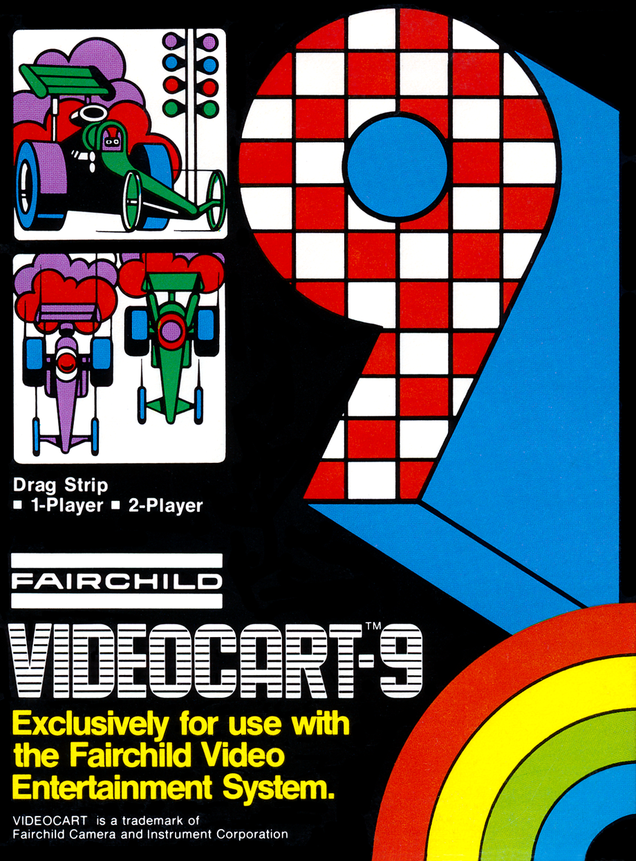
Okay, so the problem with trying to rank the first seventeen Videocarts is that they all look so similar. When you line them all up, none of them really stand out.
Except for Number 9. And I’m not just saying that because I wanted to make another “White Album” reference.
The checker pattern inside the “9” instantly sticks out from the other numbers.
Plus, the car illustrations have a certain energy and “cool” factor that the other Videocarts never quite match.
3. Checkers
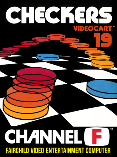
I thought Checkers could look exciting. All it took was a fish-eye perspective and trippy motion trails that make the checkers look like flying saucers. Someone should make a Checkers game in the visiual style of Tetris Effect
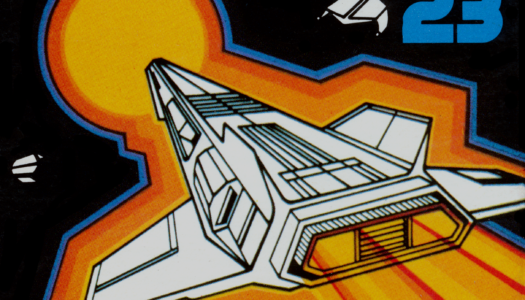
2. Galactic Space Wars
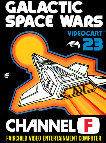
The cover of Videocart-5 (aka Space War) portrayed spaceships as flying saucers. Galactic Space Wars portrays them as jet fighters in space.
What changed between 1976 and 1978? Star Wars and Battlestar Galactica.
The dynamic diagonal composition also helps.
1. Bowling / Football (Tie)
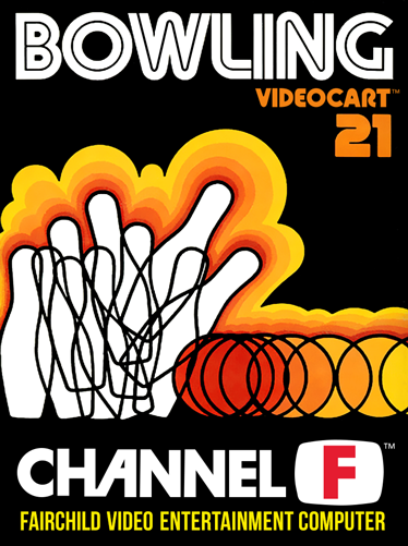
A concept so nice they did it twice.
The sense of movement is a lot more effective on the Bowling cover, where the overlapping circles bunch up at the point of impact, and the pins feel like they’re shattering into the air.
Strangely, this was the only game title to use Yagi Double (aka the SEGA font).
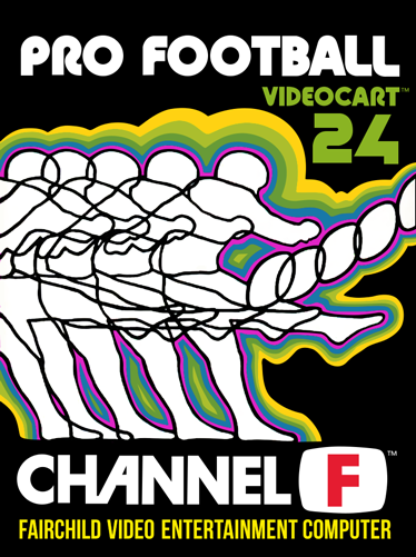
Football’s cover feels a little lazy in comparison because the player’s pose doesn’t change. He looks like an action figure being pushed forward instead of someone winding up a kick. But it still looks cool.
If all the late-era covers were in this style, it could’ve become the Channel F’s trademark look, like Atari’s painted collages that Magnavox actually did first.
If you enjoyed this, please consider supporting the site on Patreon!
Sources
- Atari Archive: Channel F Release Dates
- ChannelF.se
- FND Collectables: Fairchild Channel F [Archive Link]
- They Create Worlds, Vol. 1 (1971-1982) (2019)
- The Untold Story Of The Invention Of The Game Cartridge (Jan 2015)
- Weekly Television Digest
SPECIAL THANKS: Fredric Blåholtz, Kevin Bunch, Benj Edwards, Ethan Johnson, Alex Smith, John Strauss, and Nick Talesfore.
Comments
Join the discussion on my Patreon page!
You Might Also Like


