When Jim Steranko drew the classic X-Men logo in 1968, he made a few mistakes...
The X-Men ‘97 logo has a more complex history than you might expect. Although immediately recognizable to longtime fans, this particular variation on the iconic logo wasn’t introduced until 1994 — a few years after the original ‘90s X-Men cartoon began.
The 1994 variation fixed a bunch of subtle yet significant errors in the way the original logo was drawn three decades earlier. To understand the hows and whys of it all, let’s first go on a short journey into the history of what I like to call the “X-Men Wedge.”
The Origin Of The X-Men Wedge
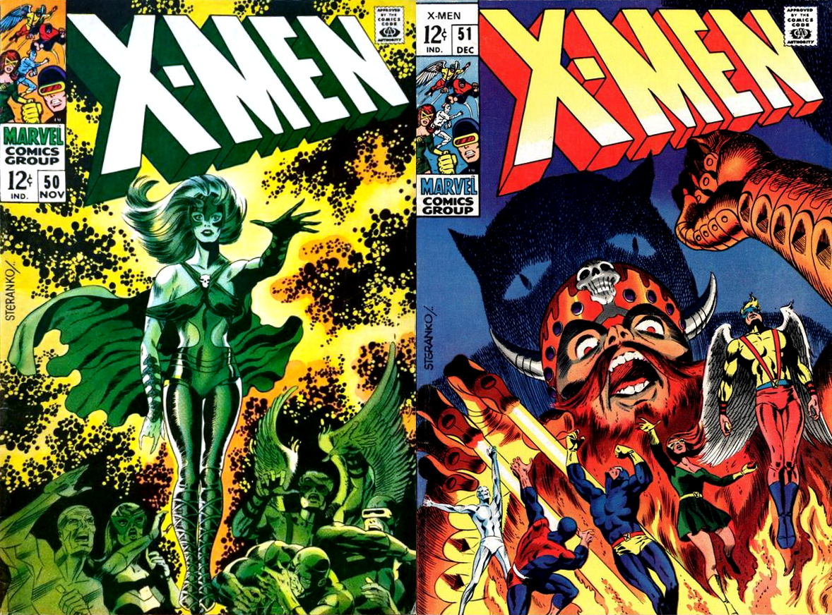
In 1968, artist Jim Steranko — perhaps best known for Nick Fury, Agent Of S.H.I.E.L.D. — was asked to do a short two-issue stint on X-Men, at which time he introduced a new logo for the series. That it happened to be the book’s 50th issue was apparently just a coincidence.
As Steranko told Gary Groth in a 1970 interview published in Fantastic Fanzine #11:
I did that work as a favor to Sol Brodsky, who said, “We need a story and we need it fast,” and I did a couple of them for him. But, the work was deplorable.
As a matter of fact, I didn’t even sign my name to it. I told them to leave my name off; I told them to put somebody else’s name, a fictitious name in, but I think they used my name anyway, somehow.
I’m not very proud of the work. It was done very fast, and I had no interest in that strip. It was simply as a favor to Marvel that I did those stories.
And yet, despite his disappointment in how the issues themselves turned out, the logo he introduce made a lasting impact. When asked about it in the same interview, Steranko simply offered, “I didn’t like the one they had, and I asked if I could do it.”
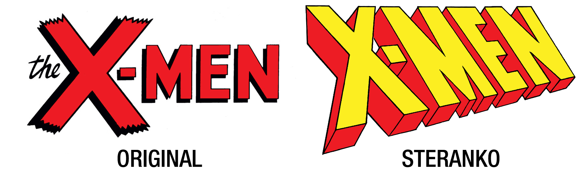
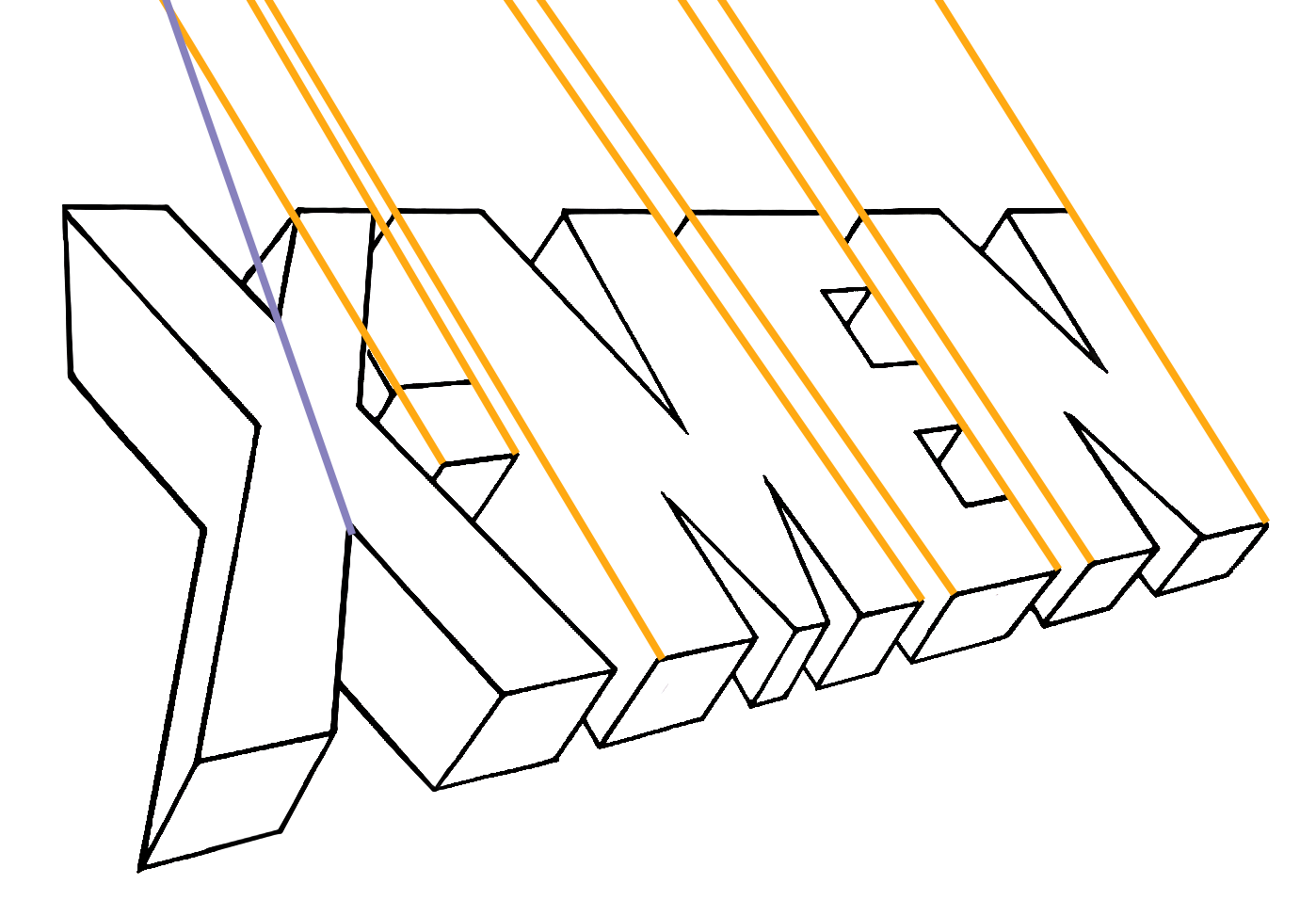
But perhaps due to the quick turnaround of the issues, the logo contained a number of errors its three-point perspective. Most notably, the vertical axis — which should converge towards a single vanishing point high above the text — is all over the place, with the “E” and “N” actively steering away from any such point, while the “X” was seemingly decided on following its own separate point.
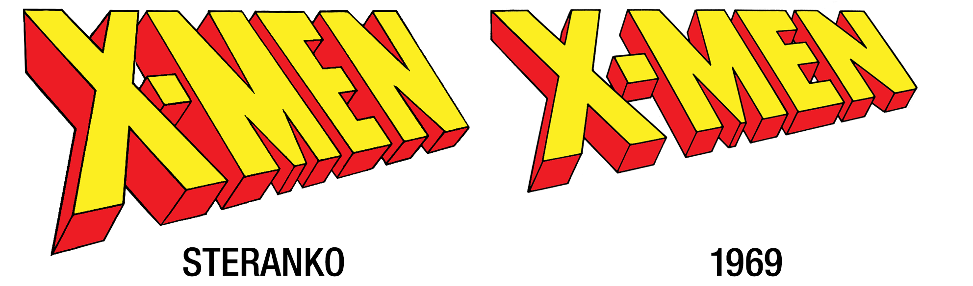
Still, no one can deny the timeless nature of Steranko’s design. So it may surprise you that this incarnation lasted only ten issues — less than a year! Beginning with X-Men #60, the logo was redrawn by an unknown letterer, presumably to create a shorter logo that would take up less vertical space on the cover, while also fixing up most of the perspective issues.
The shorter vertical height allowed for slogans and text to be placed above the logo, such as “The Strangest Teens Of All! X-Men,” “The All-New, All-Different X-Men,” and eventually, “The Uncanny X-Men.”
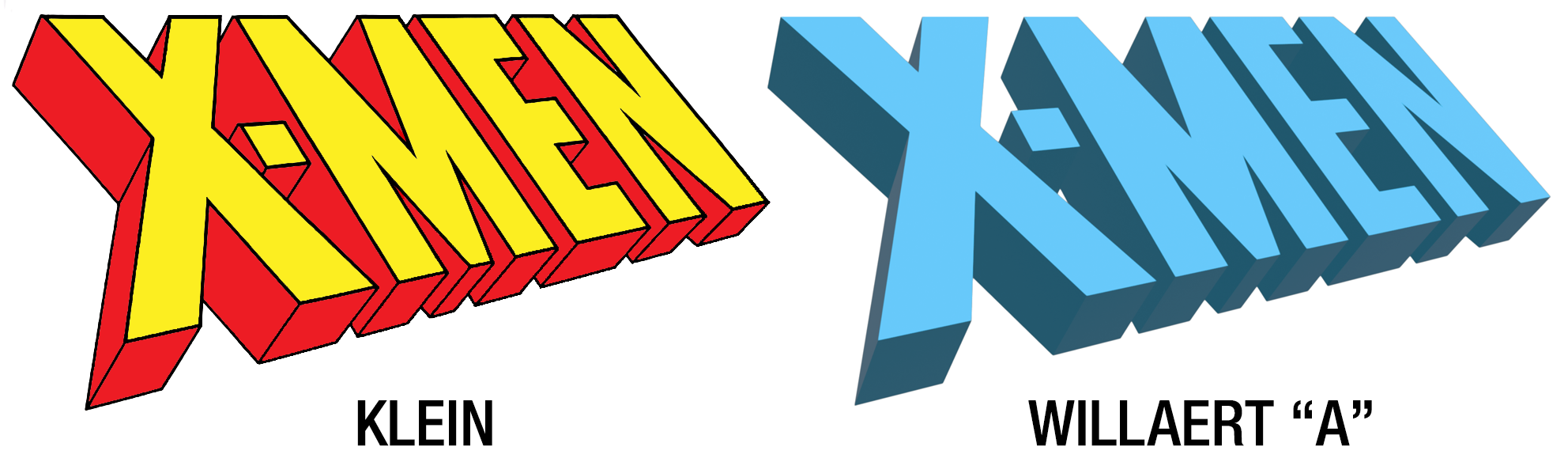
Then, in 1991, a new adjectiveless X-Men book was launched to run alongside The Uncanny X-Men. But rather than go back to the Steranko logo, Marvel staff simply took the 1969 logo, stretched it until it was slightly taller than the Steranko original, and traced over the result.
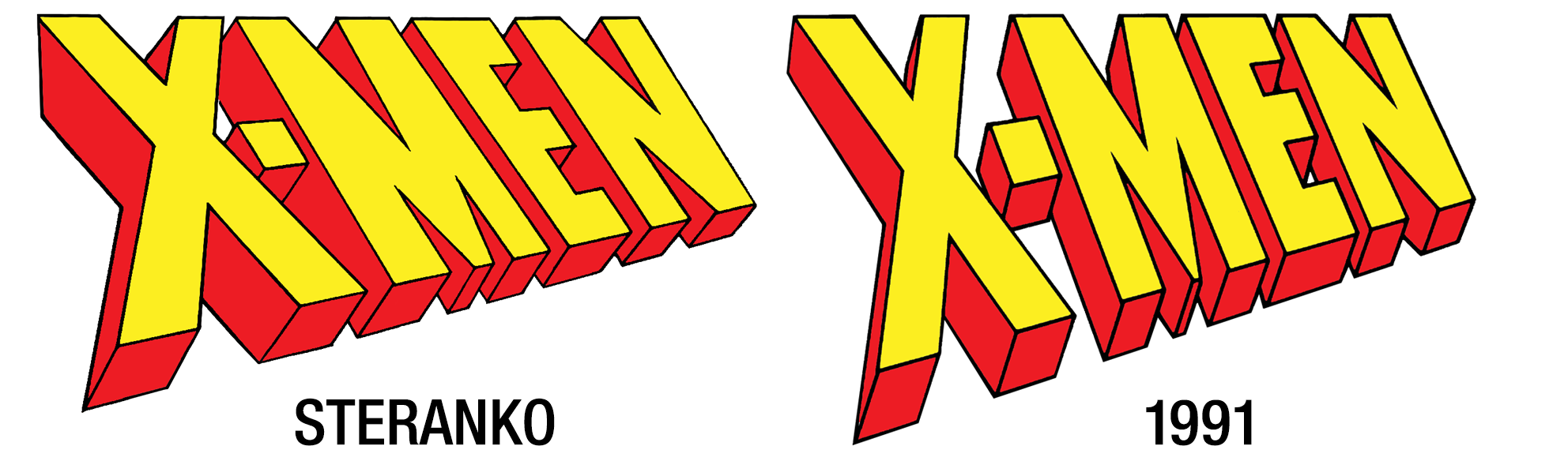
The 1991 logo became the default for the comics, but not on merch, where the 1969 wedge appeared on nearly everything, including the ’90s VHS tapes, the action figures, and the cabinet art of the X-Men arcade game.
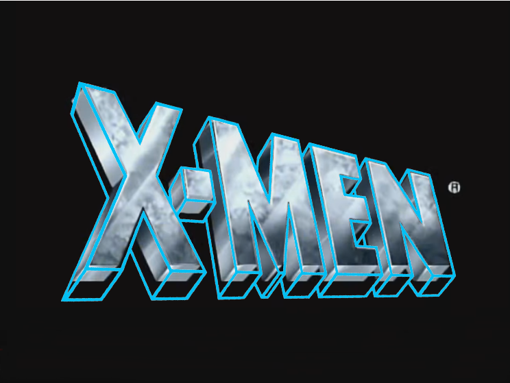
But surprisingly, neither of these were the logos used on the title screen of the ’90s cartoon. Because there was also a second 1991 wedge!
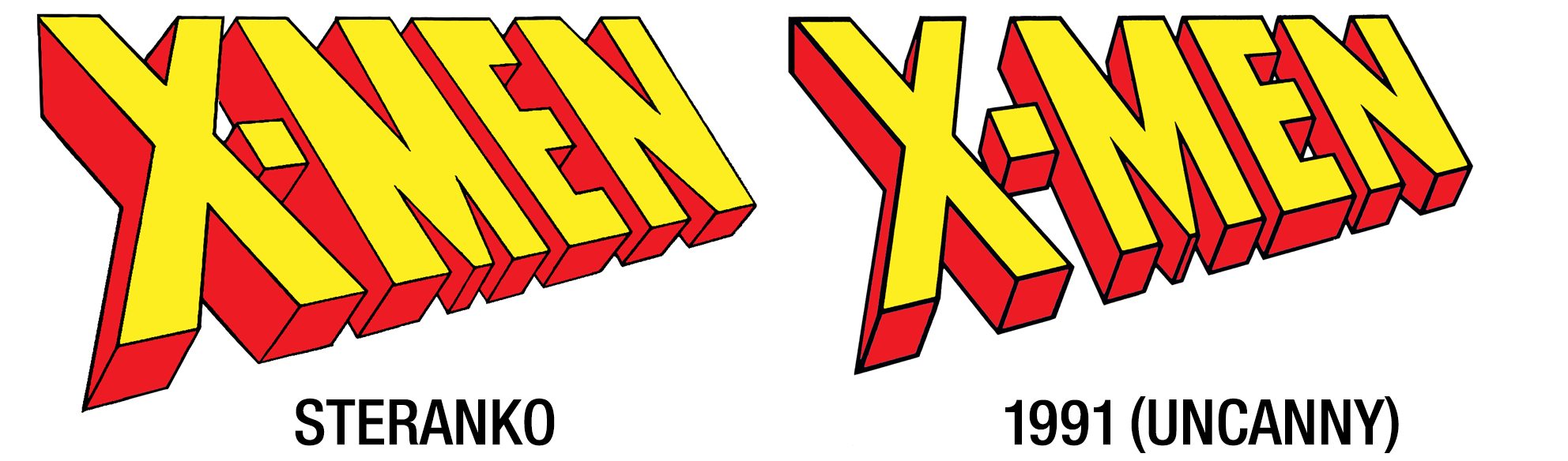
Despite the 1991 logo presumably being created for X-Men (Vol. 2) #1, it actually debuted a few months earlier on the cover of Uncanny X-Men #276, where it appeared a few more times until Uncanny got it’s own unique wedge on issue #284.
At first glance it appears to be just a slightly less stretched version of the 1969 logo, but it differs from adjectiveless in two key ways: It has the thickest outlines lines yet, and the letters are ever so slightly further apart.
This is the only wedge that fits directly on top of the ’90s cartoon title screen painting, although it appears the title screen artist opted to chop off the bottom of the wedge a bit (you can see that the lower horizontal bar of the “E” is thinner than the others as a result).
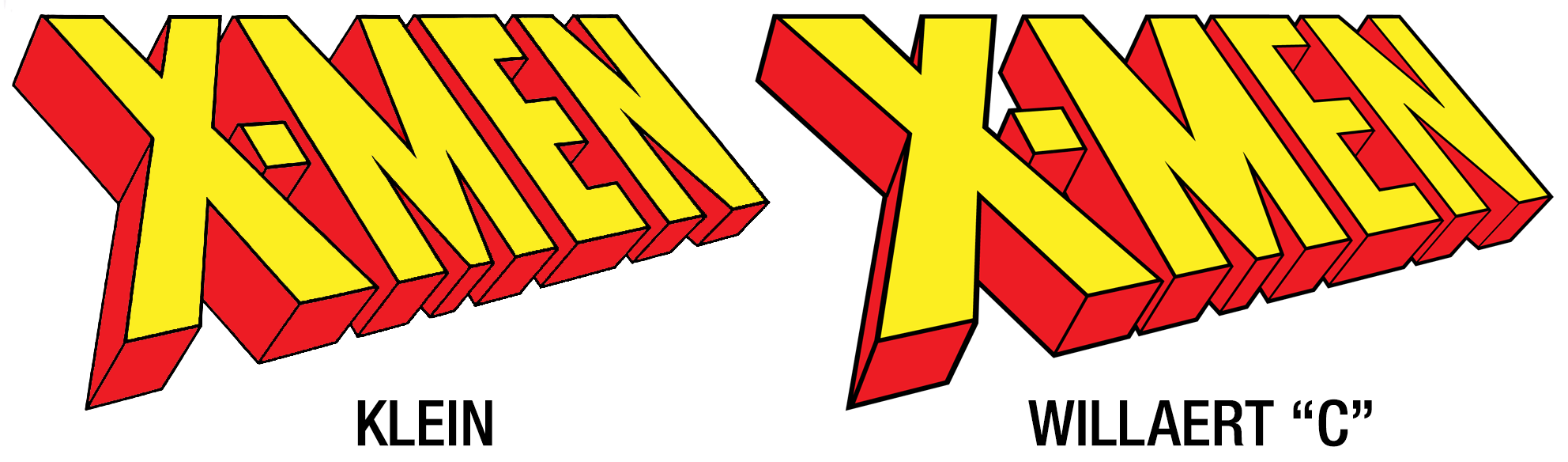
A few years later, fifth wedge came into play. In a multi-part retrospective on the X-Men logo, letterer Todd Klein says the X-office wanted to revive the 1968 original in 1994 and asked if he could trace it off of a Neal Adams X-Men cover he owned. But rather than merely trace as asked, Klein offered his own variation, which fixed up all of the perspective issues while remaining true to the shape and spirit of Steranko’s drawing.
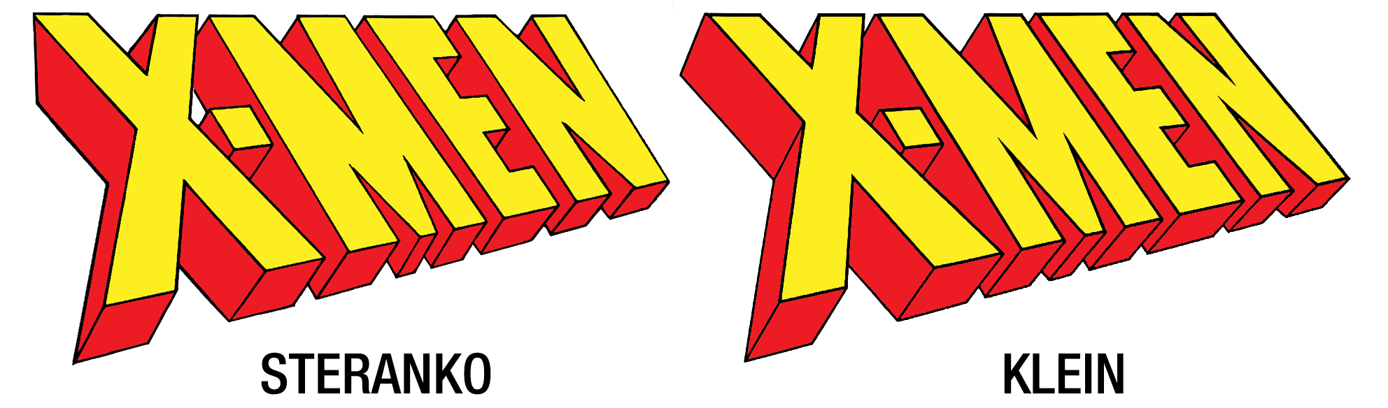
The resulting design was so solid that it remains the go-to version of the X-Men Wedge today. Admittedly, the changes are very subtle, but they really add up. Let me show you.
From The Ashes
If we lay the two logos directly on top of each other, we can see that the general shape is nearly identical, but within are many tweaks. So many, in fact, that it can be a little overwhelming to look at.
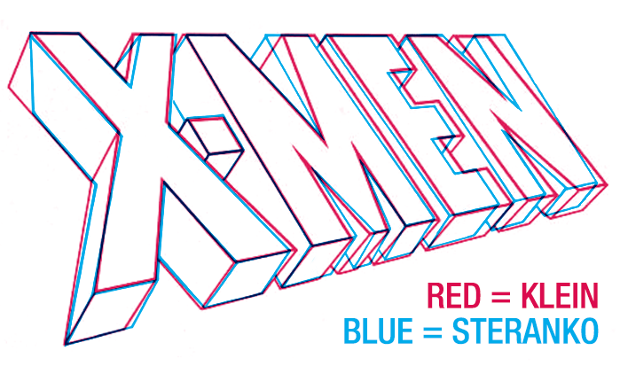
The difference is much easier see if the text is flattened out, removing the perspective. In the example below, note how the Klein’s letters stand straight up (well, except for the “X,” which leans into the “M” a bit), while Steranko’s letters lean every which way.
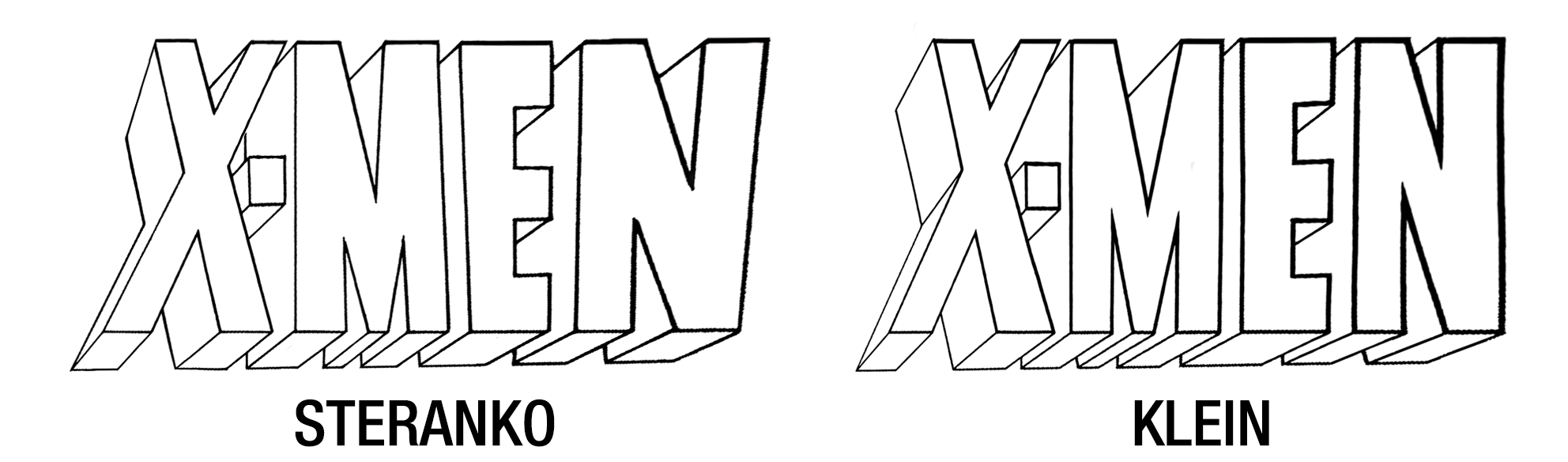
You might also notice that Klein’s letters get progressively thicker from left-to-right. This is likely a feature rather than a bug; the distant letters might start to look too thin when placed within accurate perspective.
Actually, now I’m curious: What would the wedge look like within accurate perspective? Adobe Illustrator now features a 3D Text tool that would allow me to let the computer generate the telescoping effect, so let’s see what happens.
First, let’s create the flat text. If I adjust all the letters to be the same thickness as the strokes in the “M,” I believe it should look something like this:
It took me a few tries to get the angle just right, but I think this looks pretty close:
If you compare it to the Klein wedge, you can see that not only does the “E” get quite a bit thinner on the model, but the “X” also looks way thicker. However, I feel like this dramatic variation gives it a lot of dynamic impact.

But problems arise when converted into a line drawing. Outlines flatten the logo, and the flatness only emphasizes how thick and thin the letters look now. When it comes to Klein’s version, you might say the incorrectness is ultimately more correct.
But as a final experiment, what if I vary the weight of the lines? Thicker lines give the illusion that an object is closer to the viewer, so what if I have the lines get gradually thinner as the letters get further away?
This time the lines got so thin on the further letters that I decided to group the whole wedge together with a thicker outer outline. What do you think, is this a satisfying outcome? Or have I gone too far? Let me know in the comments of my Patreon page.
You Might Also Like


