NaNoWriMo: How To Make The “Comic Sans Trick” Work With Any Font
It’s National Novel Writing Month (NaNoWriMo) again, and everyone is looking for ideas to increase their writing speed. One trick that’s recently become popular is to write your first draft in Comics Sans, because somehow the font seems to hack your brain into making writing easier.
Why does it work? Some believe that the hand-written letters somehow make the words easier to digest, while others speculate that the ugliness of the font subconsciously disarms your inner critic.
But I know the real reason why it works, thanks to my years as a professional graphic designer, and I’m here to tell you how you can get the same effect out of any font you choose. Because there’s nothing special about Comic Sans.
Let’s get right to the point: When reading large paragraphs of text, studies have found that ease of readability is influenced by the number of characters per line, which refers to not just the letters per line, but also the spaces and punctuation. Too few characters, and the text becomes too vertical, making it hard to get into a good flow. Too many characters, and each line becomes too long, causing our brain to become exhausted.
According to research, the sweet spot is somewhere between 50 to 60 characters per line, though you can still comfortably read up to 75 characters, which is roughly how many you’ll find in a typical print novel. Magazines and newspapers, on the other hand, break their text into columns because they want to fit more words onto larger pages, and a giant page filled with long rows of tiny text would just sap all of your reading energy.
But many websites and applications don’t take this into account at all. For example, have you ever had trouble focusing while you were reading a lengthy but very important email? It’s probably because your email client — like most email clients — does not cap the line width, causing those lines to stretch on and on forever, until they hit the edge of the window.
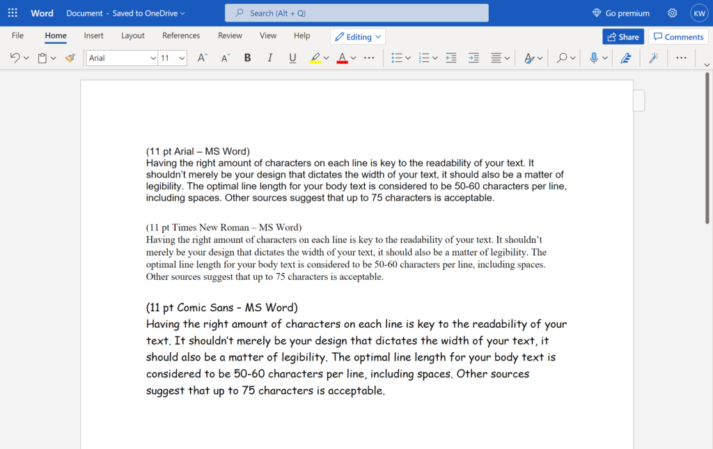
So what does this have to do with Comic Sans? Well, when you open up a new Word document, the default text size is 11 points. Arial at 11 points is 90 to 100 characters per line. Times New Roman is 95 to 105 characters per line. But thick & chunky Comic Sans at 11 points is 75 to 85 characters per line — almost the same amount as a novel.
Want to achieve the same effect while using Arial? Just bump it up a few points. Arial at lucky 13 is the equivalent of Comic Sans at 11, though I’ll sometimes even bump it up to 14.
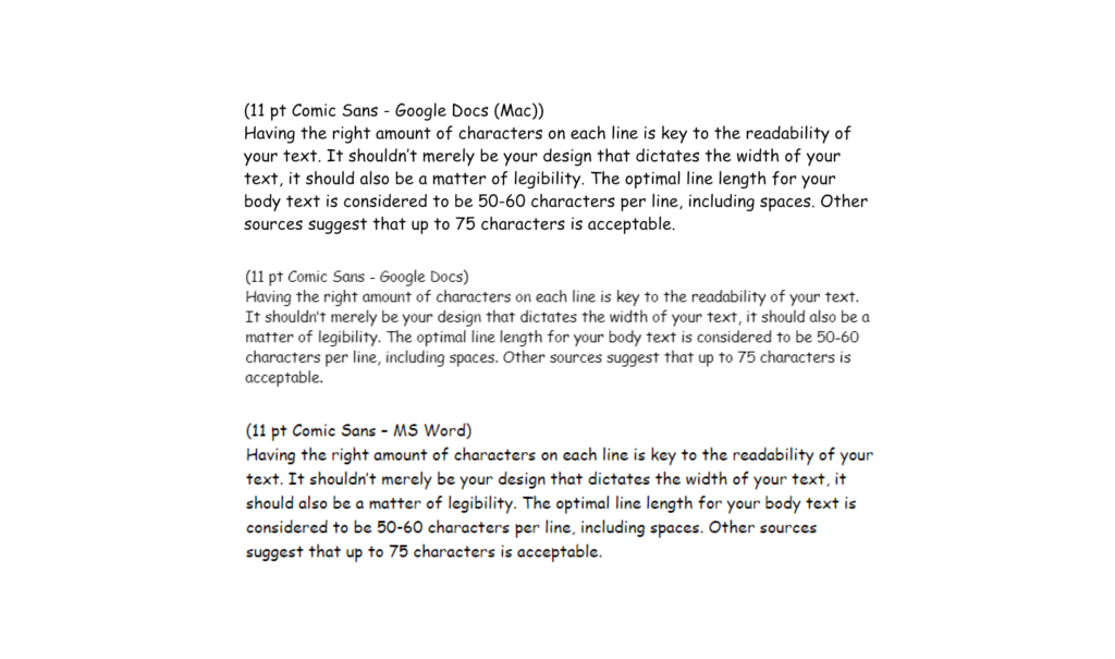
Strangely, Google Docs on Windows renders Comic Sans thinner than MS Word, or even from Google Docs on a Mac. So if you’ve been trying to use the Comic Sans trick in Google Docs on a Windows computer, you probably weren’t getting as much benefit out of it as your friends on other platforms.
But for some, just about any decrease in characters-per-line probably feels like some sort of improvement. Just look at the Lifehacker article that started this whole Comic Sans trend. The illustrations show an improvement from a daunting 145 characters, to a slightly less daunting 125 characters. But if only the author had been using a text editor that capped the width of the lines, she might’ve found it even less difficult.
The inconsistency in the advantage that Comic Sans has over other fonts could also explain why Comic Sans is preferred by some people with dyslexia, while other dyslexic readers actually find it *harder* to read! According to researchers of dyslexia, it isn’t so much the style of the characters that make it easier to read, but the space between the characters, and maybe even the number of characters per line.
So give my trick a try. And rest assured that it’s still okay to hate Comic Sans.
But before I go, here’s one more tip. Are you writing an important email and want to make sure that the *other* person finds it easy to read? If you’re sending it from Gmail, just click these three dots and select “Plain Text Mode.” When you hit send, you’ll see that the text has automatically been forced to a maximum of 70 characters per line.
This trick comes in handy when I’m reaching out to game developers for Video Dames, my series about the history of playable female protagonists. Take a look at the rest of my channel, and please consider supporting me on Patreon. Thanks for watching!
If you enjoyed this, please consider supporting the site on Patreon!
Sources
- Autistic Me: “Comic Sans Is (Generally) Lousy: Letters And Reading Challenges” by Christopher Wyatt (Feb 24, 2010)
- Baymard Institute: “Readability: The Optimal Line Length” by Christian Holst (Nov 1, 2010)
- Creative Market: “Is Comic Sans Easier for Dyslexic Users to Read?” (Mar 21, 2021)
- Lifehacker “Get Over Yourself And Start Writing In Comic Sans” by A.A. Newton (Dec 20, 2018)
- Medium: “Hating Comic Sans Is Ableist” by Lauren Hudgins (Feb 23, 2017)
- TES: “Does Comic Sans Really Help Dyslexic Learners?” by Jon Sever (Oct 6, 2020)
MUSIC: “Hard Boiled,” “George Street Shuffle,” “I Knew A Guy” by Kevin MacLeod (incompetech.com).

