
“Don’t judge a book by its cover,” the saying goes.
This age-old idiom originally meant you shouldn’t judge a person by their shabby clothing. But in a literal sense, I judge the cover of every book I see — as well as every movie poster, comic cover, and album sleeve. I kind of have to. As an artist and designer, it helps keep me sharp.
However, video game art is a little different. In any other medium, the question I ask myself is how effectively the cover represented its contents. But early video game box art wasn’t aiming for that at all — it was trying to transcend its contents; to move beyond the limitations of its medium; to put a picture in your head while you played.
Or at least, that’s what it became eventually. It turns out the very first box art was much more…literal.

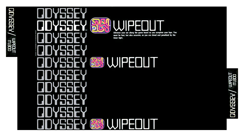
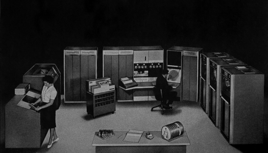
Before WipEout for PlayStation, there was Wipeout for Odyssey. This rectangular box was the basic template for Odyssey’s first six individually-packaged games released in 1972. But here in the distant future 2020, it barely resembles something we’d immediately recognize as a video game box.
In fact, by some definitions it might not be considered video game at all. For one thing, there‘s no game program inside the box.
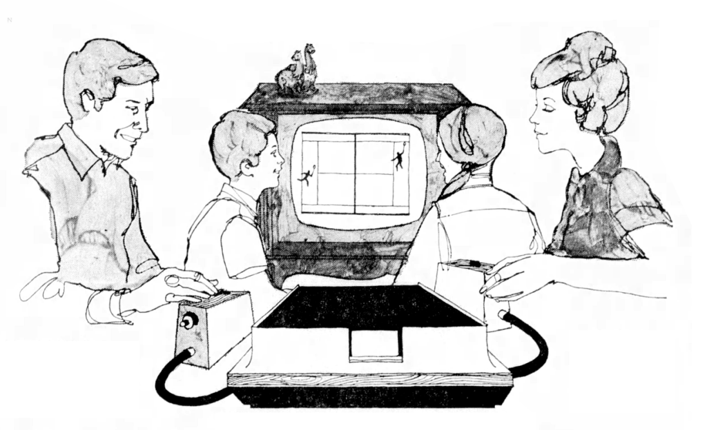
Odyssey used “game cards,” which at first glance looked like game cartridges, except it contained no game logic. All of that was built into the console itself, with each game card used to merely select the game mode.
So how do you add new games to a console that can’t accept new programming? By treating the console like a special component for high-tech board games.
Each game came with a new set of instructions, additional game pieces, and maybe even a second board to supplement the one on your TV. Your TV was converted into a “board” using translucent color overlays, with pieces you could move around using the controllers.
The overlays were the reason for the game boxes’ odd shape and size. They didn’t want to fold or crease the overlays, so they rolled them up inside a long box.
I know this doesn’t sound anything like video games as we know them today, but considering that you couldn’t play them without the corresponding video game console, let’s just agree that these were video games of an early and experimental variety.
The packaging design was equally experimental. The repeating “Odyssey” logo (in a font called Moore Computer) is rad as hell, but the rest of the art consisted of just the game title (in a custom-made non-bold version of Moore Computer), a small “screenshot” of the overlay, and a short description on front.
In a particularly bold (or confusing) move, the back was left completely blank. With no established model to follow, they were just making it up as they went along!
The template was redesigned for the second wave of games in 1973:
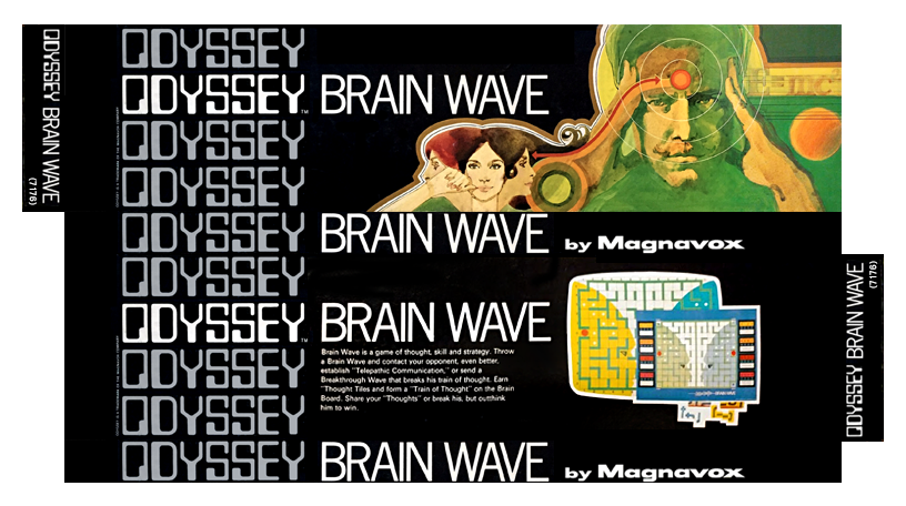
This box was an improvement in almost every way. The back now displayed a longer description, a larger screenshot, and an image of the boxes complete contents so that customers knew exactly what they were getting.
I particularly love how the game’s title lined up perfectly across all four sides. It almost made up for the change of font: from quirky custom non-bold Moore Computer to ho-hum Trade Gothic.
But most importantly, moving all that basic information to the back made room on the front for imaginative watercolor illustrations. This type of imagery is usually associated with Atari, but it turns out Pong wasn’t the only thing Odyssey did first!
“Montage” style of illustration was a major trend of the ’70s. It may have been a reaction to the threat of photography, which was slowly replacing commercial illustration in magazines and advertising. Arranging multiple overlapping scenes into a cohesive full-color composition wasn’t easy to do with photography in the days before Photoshop.
The trend is usually credited to Bob Peak. Although Peak didn’t invent the concept, he popularized it by injecting a stronger sense of design into montage illustration, beginning in the mid ’60s. Soon enough, everyone was jumping on board.
The look was actually on it’s way out by the time Atari adopted it in the late ‘70s, but it was at its peak (no pun intended) in 1973 when the second wave of Odyssey boxes were released.
Let’s rank them.
4. W.I.N. (1973)
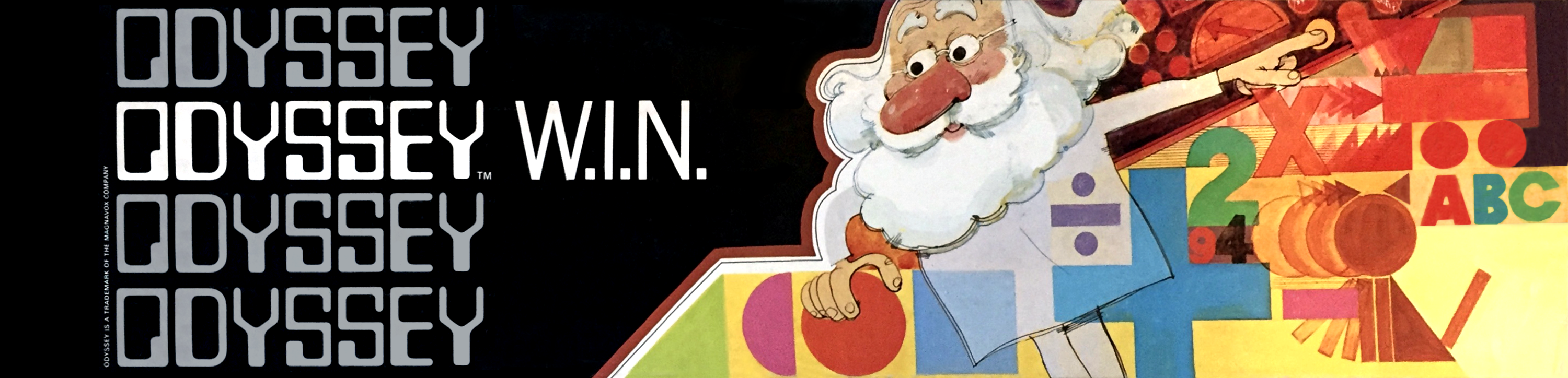
W.I.N. stands for “Words, Images, and Numbers.” It’s an educational game, but it’s trying so hard to convince you it’s exciting.
Yet I’m more intrigued by the potential horror of the scene. The doctor seems oblivious that his machine is slowly converting his life energy into letters and numbers, despite protests from his poor cat/dog.
3. Basketball (1973)
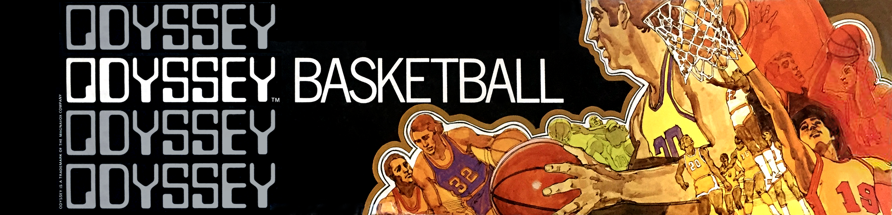
This is a great by-the-book ‘70s sports montage. If I have one complaint, it’s that it’s maybe just a little too busy — narrowing it down to three scenes might’ve made for a stronger and more focused composition.
Interesting side note: This is the first video game box art to feature black characters. It could be better — making a white guy the primary focus looks a little strange to us in 2020, where only around 20% of professional basketball players are white. But in the early ‘70s it was closer to 45%, and the shift pro basketball being a black majority sport was still fairly recent.
That said, basketball’s biggest stars that year were undoubtedly Wilt Chamberlain and Kareem Abdul-Jabbar, so it’s still weird.
2. Brain Wave (1973)
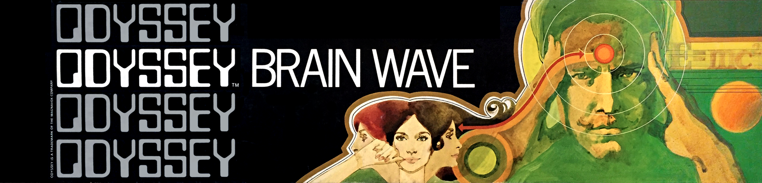
Wait, is this an unlicensed X-Men game? Did FOX go so hard with the ‘70s period piece that they got Lawrence and McAvoy on an actual period box? Not to mention that the X-Men was actually cancelled and in “reruns” at the time.
I like the idea of the little E=mc² in the upper right, but it feels out of place without a few more pieces of text like that. Where Basketball was too busy, Brain Wave is just a little too sparse. But the overall weirdness wins me over.
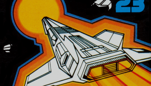
1. Interplanetary Voyage (1973)
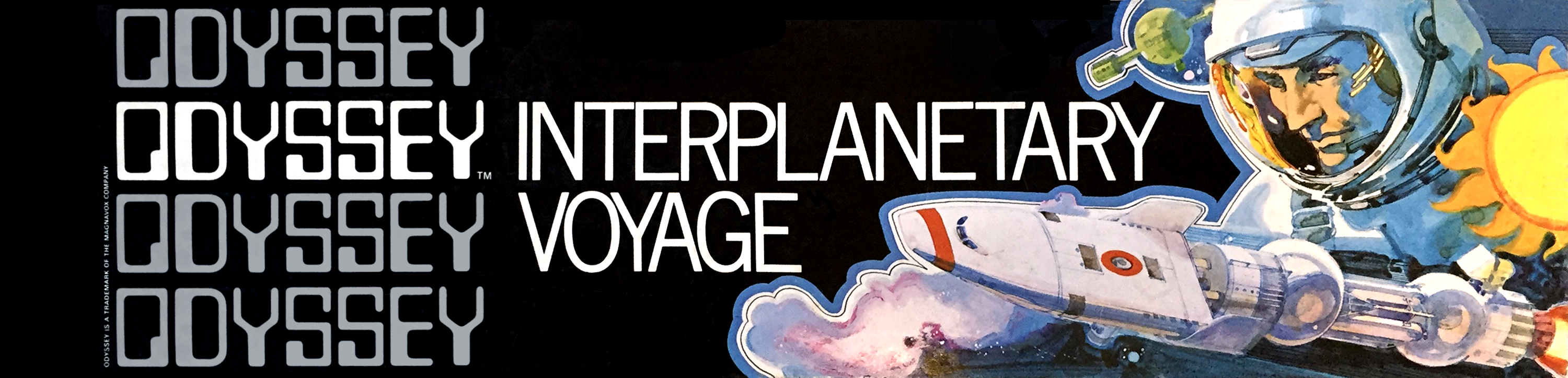
This one is my favorite for purely aesthetic reasons. I like the contrast of the machinery and the human, the contrast of orange and blue in the human’s face, the interesting shapes reflected on his visor…
There really isn’t anything weird about this one, unless you count the strangely flat sun. It’s just a really solid image, with just the right amount of montage complexity.
At this point I’m officially a fan of the artist. But who is the artist?
Bradford/Cout Design
Odyssey’s branding, packaging, overlays, and game pieces were designed Bradford/Cout Design. They also did the branding and packaging for Odyssey². But other than this, little about them is known.
Here’s what I’ve managed to dig up.
The firm was established in 1963 by designers Ron Bradford and Al Cout. They had a good run, and became Bradford, Cout & Jansen in 1992. By the early ’00s they were defunct.
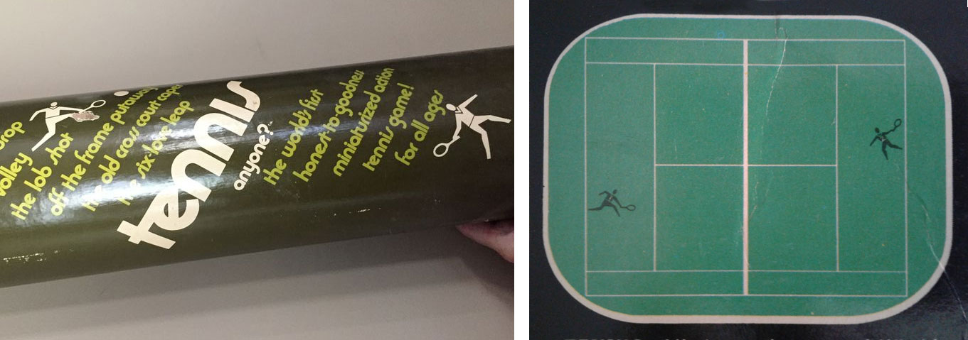
In the early ’70s, Bradford and Cout also founded Franklin Merchandising, through which they published their own tabletop games and puzzles. Like Odyssey, the tabletop games came with boards that were rolled up in a long box or tube.
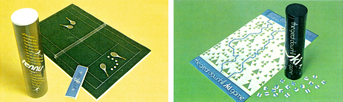
Incidentally, the Odyssey tennis guys showed up a year earlier on the packaging for Tennis Anyone?
Although Bradford and Cout were both designers, Bradford was also an illustrator, capable of working in a wide variety of styles. This makes it difficult to identify his work, because it was usually unsigned.
I’m confident he illustrated all the overlays and game pieces for Odyssey, and he painted the box art for most or all of the Odyssey 2 games. But did he do the watercolor-esque paintings we saw earlier?
I’m on the fence. He could do a variety of styles, but it also wasn’t out of the ordinary for Bradford/Cout to bring in others. All I know is that, whoever it is, it’s definitely the same artist who did the Odyssey family portrait.
If there was one downside to the amazing box art illustrations of the ’70, it’s that they aged better than most of the games they represented. Maybe there’s some literal truth to that old saying after all.
Don’t judge a game by its box art.
If you enjoyed this, please consider supporting the site on Patreon!
Sources
- $100 Home Game Involving Light Patterns Ultimate Creation Of Skokie Firm (Arkansas Gazette – Nov 16, 1972)
- Interview with Odyssey² Artist Ron Bradford (2003)
- NBA’s Racial And Gender Report Card (2019)
- Racial Discrimination In Professional Basketball: An Empirical Test (Sociological Focus – Fall 1973)
- Also: Board Game Geek, LinkedIn, Odysim
SPECIAL THANKS: David Bradford, Ethan Johnson, Barry Traeger.
Comments
Join the discussion on my Patreon page!
You Might Also Like


