Now that we’ve done the best, it’s time for the worst. Most “worst box art” round-ups just post a bunch of funny-looking covers that lend themselves to a single sentence of snarky commentary. But not this one.* Our list aims to point out box art that’s bad from a design perspective, and attempts to explain why.
*On the other hand, if you were funny-looking images with snarky commentary is what you were looking for, there’s also a little of that at the end of the article.
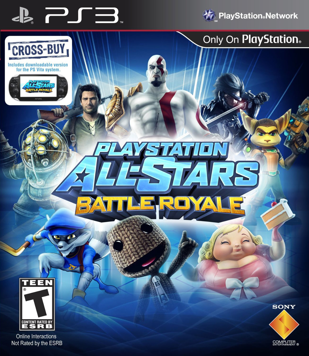
#10 PlayStation All-Stars: Battle Royale

There’s a very enthusiastic community of gamers who enjoy creating fan-made box art designs. Some of them are even quite good. Others are heavy-handed Photoshop jobs constructed of images cobbled together from multiple sources, and unified with poorly-applied gradients and effects.
PlayStation All-Stars: Battle Royale looks like the latter. How does such a major release wind up with a cover that looks like fan art?
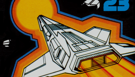
#9 Quantum Conundrum
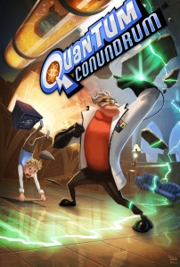
While the illustration for
Quantum Conundrum is nicely painted and would make for a nice DVD cover for a kid’s movie, it does a poor job of conveying anything about the game. If you were to ask someone who’d never heard of the game to describe what they thought
Quantum Conundrum was about, they’d probably tell you that you play as a heroic scientist trying to stop his lab from being coated in green ice, while a gust of wind threatens to blow away his boy sidekick. Which would be incorrect in every way, including the character you play as (the boy).
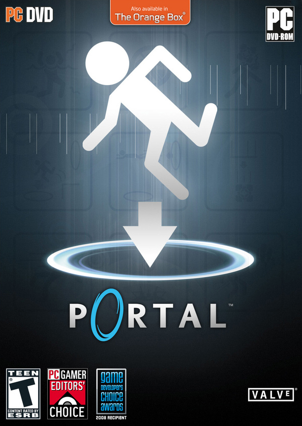
Kim Swift’s previous game had a cover image that got across the entire concept of the game using a single pictogram and the word “Portal” (see below). Quantum Conundrum‘s cover is not so effective.

#8 Resistance: Burning Skies
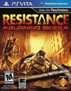
The basic image of a dead enemy on its back is a nice concept, but there are several issues that bring it down. Firstly, almost everything on the cover is yellow, causing everything to kind of blend together and making it difficult to tell at a quick glance what’s happening on the cover.
Looking a little more closely, I notice that he’s holding a gun up and his eyes are glowing, so he must still be alive. But why is he laying on his back? Looking even closer, it appears that the wrist of the hand holding the gun is coming from too far to the left to be attached to this character. Was it blown off his arm and just happened to land in the ground at just the right angle to hold the gun up? Or was it just a last minute addition tacked onto the cover to show that there are guns in this game?
Then there’s the axe. At first glance I thought it was a pick-axe. I didn’t realize it was a regular axe until I noticed the fireman holding one in the logo. Riley must’ve been really attached to this axe, because he took the time to carve his name in the handle. So why did he just leave it on the ground there? Also, the axe is the only thing on the cover not tinted yellow, which means it’s an important element that they wanted us to focus on, when it really doesn’t add anything to this image. It just looks like a random item the character forgot about and left there.
A more iconic image might have been to have the axe sticking out of the chest of a dead monster laying on the ground, with the handle of the axe overlapping the logo to add depth.
#7 Serious Sam 3: BFE
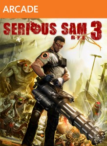
In the world of comics, there’s a phenomenon referred to as the “
brokeback pose,” which is when artists draw female characters contorting their body in strange ways in order to show off their assets. While Serious Sam isn’t showing off any assets of his own (unless you view that chaingun as a fittingly placed phallic symbol), he does appear to have a broken back. And broken neck. And maybe a few other broken things.
I’ve spent a good half hour trying to make sense of the bad anatomy on display, and I’m still perplexed. He’s almost more frightening to look at than the creatures standing behind him. If I didn’t know better, I’d swear the image was designed to be an obscure reference to Rob Liefeld, complete with lack of feet.
#6 Emergency 2013
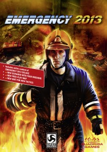
We’re all familiar with the look of a shovelware cover. In a way, these bad covers are almost good, in that they tip us off to the questionable quality of the games within. What’s strange about this particular Photoshop masterpiece is that it comes from Deep Silver, the same publisher as
Dead Island. Could they not afford a more professional looking cover, or is there some marketing strategy I’m unaware of behind budget titles always having budget-style cover art?
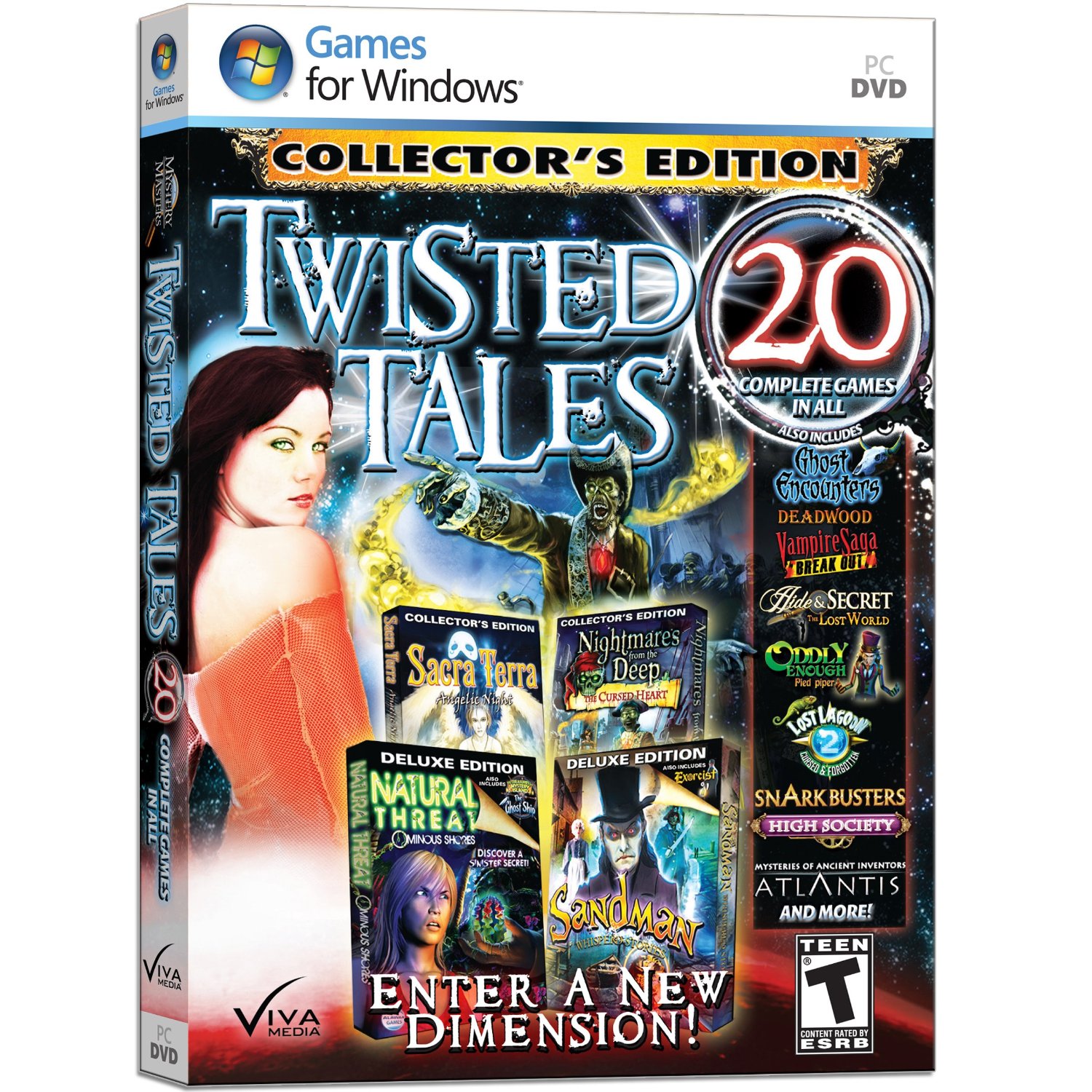
#5 Mystery Masters: Twisted Tales

Normally I don’t include budget titles in my “worst” lists, because they’re such easy targets. Plus, if these games started producing better covers, it’d become more difficult to spot and ignore them. But this style of cover particularly confounds me. Someone over there decided that the best way to sell this game would be to throw 12 of the 20 games titles on the cover, in the hopes that maybe one of these generic titles would sound interesting enough to sell the whole collection to someone. In reality, the big group of stuff just becomes noise, and few people are ever going to look at that box long enough to read any of the titles.
Even funnier, the full title of the collection is Mystery Masters: Twisted Tales, and yet they left the words “Mystery Masters” off the front, presumably to make more room for all those other titles.
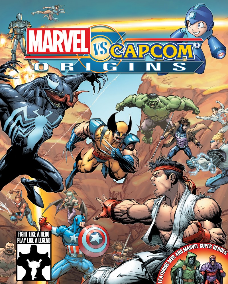
#4 Marvel Vs. Capcom Origins
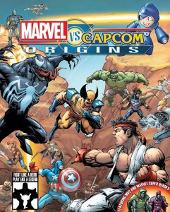
Once upon a time, Capcom was known to art-conscious gamers as being the company with some of the greatest concept artists in all of Japan. How times have changed. The cover art for
Marvel Vs. Capcom Origins looks like they scanned in a high schooler’s notebook doodles and had them professionally colored. I’d critique the pieces composition, if there was one. I can’t imagine what circumstances led to Capcom publishing such a sub-standard piece of art. Unless it was a piece of fan art that they were able to use for free.
#3 Style Savvy: Trendsetters
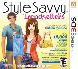
The wall of text on this cover is the sort of thing I expect from shovelware, but not from a first-party Nintendo-published title. Even worse, it looks like they decided to change the size or style of each line of text to ensure that every line would stick out equally; in reality, trying to make every line stick out equally is about as effective as using a highlighter to highlight every sentence on a page. I think the wall of text was an attempt to emulate fashion magazine covers, but even fashion mags look more stylish than this.
#2 The Wii U Trade Dress
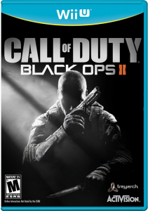

The blue and yellow color combination of the Wii U’s trade dress looks very Fisher-Price – which might’ve even been intentional, to make the Wii U seem more toy-like. This look works pretty well for games that are more cartoony or all-ages, but when paired with cover images that are darker or more serious, there’s a major clash in tone. Thing is, I think the blue would’ve worked just fine if the yellow line wasn’t there, or if the yellow was changed to white. But there’s something about the combination of light blue with yellow that just kills the mood of these covers, like “Baby’s First Call Of Duty.”
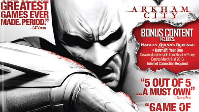
#1 10 Out Of 10: Game Of The Year Edition

I would like to thank the designers of the cover for
10 Out Of 10: Game Of The Year Edition, Featuring Batman: Arkham City for making the #1 worst cover such an easy choice this year. Note that I said designers plural; there is a very high probability that this cover was the result of design-by-committee. Some of the decision making on covers like this can even come from producers with little or no design knowledge or experience.
But what exactly is so bad about the cover? For one, it looks like the game should be called 10 Out Of 10: Game Of The Year Edition. The “10 Out Of 10” quote is more prominent than the game’s title, and even the other quotes and the “Bonus Content” box are fighting for attention wih the title. Filling covers with text leads to very noisy designs. The job of the front cover should be to get someone to look at the back cover (or description page), and these big nice quotes would’ve been great on the back instead.
Bonus: The Peanut Gallery
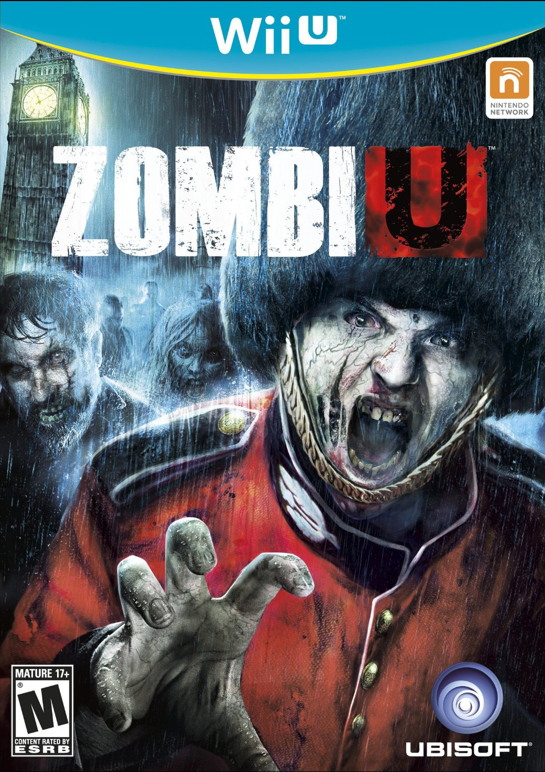
 Maybe in the UK the idea of a Royal Guard turned into zombie is a frightening idea, but to Americans, seeing a zombie front and center wearing a giant Bearskin hat looks more comical than scary. Because we are culturally insensitive. And also, because zombies wearing hats is funny.
 The Yip Yips got lost on the way to Double Fine’s Once Upon A Monster.
 Even the box art is mocking you for buying this game.
 I…think I’ll pass.
NEXT: The best alternate covers, and honorable mentions.


