It’s said you should never judge a book by its cover. But the simple fact is that we all do it. We can’t help ourselves.
The job of a cover designer is to create an image that makes you want to read that book—or in our case, play that game. A successful cover has two goals to accomplish: it needs to get your attention, and it needs to visually summarize what makes this game so great that you should play it. Unfortunately, the covers of Mass Effect do neither of these.

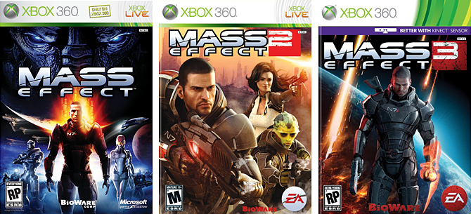
Left: Japan edition box art. Center: Mass Effect standard edition box art. Right: Limited Collector's Edition.
When I bought Mass Effect used (before the release of the sequel), I knew nothing about the game other than that a friend said I would like it. I was just returning to videogames after a lengthy absence, and was looking for some good, cheap games for my new Xbox360. But holding the game in my hand and contemplating my soon-to-be purchase, I wondered based on the cover what made this game particularly better than any of the other seemingly interchangeable sci-fi shooters starring Generic Space Marine Man.
Of course, I ended up loving the game. But I loved it for reasons that were not indicated anywhere in the cover art.

A quick example mock-up.
So let’s stop for a moment and ask ourselves: what makes this game different from other sci-fi shooters? Or different from other games in general? What makes this game unique? Probably the first thing that comes to mind for me is the Paragon/Renegade dichotomy, and the dialogue choices related to it. Because they are assigned the colors blue and red, it would be fairly easy to represent this aspect visually on the cover using some sort of blue/red split. It wouldn’t indicate what specific choices are in the game, but it would be enough to get across that there are choices to be made, sides to be chosen.
But why not take things a little further? If we were to place an actual line down the middle, we could have Shepard wearing one type of armor on one side and a different type on the other, which would hint at the upgradeable equipment in the game. Even better, one side could be male Shepard and the other side female Shepard, illustrating fact that you’re not stuck playing Generic Space Marine Man—you can customize your character, and even choose their gender!
Story choices and character customization in particular are fairly uncommon in sci-fi shooters. These are what makes this game unique, and if indicated in the cover art in some way would make the game stick out on the shelves. But for some reason, Bioware seems almost afraid to advertise what makes their games unique—neither Mass Effect nor Mass Effect 2 mentions story choices even on the back of the box, and only the first game mentions any character customization, in a vaguely-worded bullet point. They seem to be absolutely adamant about selling this game as a completely un-unique sci-fi shooter starring Generic Space Marine Man (who they consider to be “iconic“), a theme that continues throughout the standard edition box art of the rest of the series.

Left: Unreleased early design. Center: Mass Effect 2 standard edition box art. Right: Collector's Edition.
Apparently the Mass Effect 2 image at top left was originally going to be the US box art, but when the cover wasn’t well-received, they opted to use the international box art for the US as well. Honestly, I’m not sure I find one to be particularly better than the other. At least with the first game they were attempting to go for a space opera movie poster look; this time around they skip past generic videogame cover design and successfully imitate generic comic book cover design instead, which is a step down as far as I’m concerned (I say as a comics fan who has seen many, many covers).
But then there’s the Collector’s Edition cover. You can’t tell me that this was done by the same designers who created those other two covers—this thing is fantastic! Or at least, it would be, if the game was called N7. It took me awhile to realize the image is actually a close-up of his chest, since I never really payed much attention to what was written on his armor on the covers, and you don’t see it much at all while playing the actual game. In fact, plenty of Mass Effect fans don’t even know what it means. I asked James if he knew what it meant—wondering if maybe I just hadn’t payed enough attention—and he speculated maybe it had something to do with the character’s ship, the Normandy. I had to look it up on the fan wiki to discover that each character’s rank is indicated by a letter a number: “7” is the highest level of proficiency possible, and the “N” stands for…special forces. Don’t ask me.
Anyways, if it had said “ME2,” it would’ve been miles above the other covers. Or even if a bigger deal had been made of “N7” in the first game, so it’d be memorable enough to be recognizable, but it’s too late for that. The cover doesn’t really illustrate what the game is about (or even what type of game it is), but it’s definitely eye-catching. It reminds me a little of T2.

Left: Unreleased early design. Center: Mass Effect 3 standard edition. Right: Collector's Edtion box art.
Wait, what is he standing on? I assume he’s not a giant standing on a planet, or standing on a floating platform and suddenly able to breathe in space. Is he standing in front of a window, or maybe a screen?
It’s interesting is how the composition of the earlier version of the design, with Shepard filling more of the cover, doesn’t draw as much attention to the awkward relationship between the figure and the background. But shrink him down a bit, and suddenly it looks a little silly, like he’s standing in front of a weather forecaster’s green screen, looking intense. Although the earlier design would look more balanced if the logo was pushed down a little to make it vertically centered, rather than looking randomly played over his chest.
The cover of Mass Effect 3 belongs to a category I call the GamesRadar Special. During GamesRadar’s “Week Of Hate” a few months ago, they published an article entitled 8 Hated Box Art Cliches. At first, the items listed seems so absurd to label as “cliches” that the article appears to be either a parody of snobbish graphic designers (like myself), or just poking fun at GamesRadar’s “Week Of Hate” in general. Except it confuses things by actually making a few good points (on top of being unusually devoid of laughs, if it was meant to be a comedy piece).
According to the article, a non-cliche cover requires that your main character be facing forward, looking right at the viewer, both eyes visible, with mouth closed. They must be larger than the logo. If they are holding any weapons, they cannot be pointing them at an offscreen enemies. Also, they cannot be facing a visible enemy, nor can the enemy (or main character) be represented as a “floating head;” presumably, your choices are to either have one standing next to or behind the other, or to simply not feature the enemy (or main character) at all. This is the GamesRadar Special.
The secret to making your cover stick out is to take note of what types of covers other people in that field are designing, and then make yours look as different from that as you can. So the article has a point when it says that if a lot of people are doing, say, covers where the character is looking over their shoulder, you should avoid that if you want your cover to be noticeable. However, it then goes on to claim things as cliches that are just utterly bizarre. If a character with their mouth open is a cliche due to it being so common, then a character with their mouth closed is just as cliche. If a character looking away from the viewer is a cliche, then so is a character looking right at the viewer.
The problem with the GamesRadar Special is that it isn’t some sure-fire way to avoid cliches—it’s an entire cliche of its own.

Other than ME3, this collage is limited to only 2011 releases.
But then there’s the Collector’s Edition cover again. Look, I’m going to be straight with you: I’m a sucker for videogame covers that look like they could be album covers (see: Awesome), and I’ve heard this new band N7 really rocks. Seriously, if this cover just said “ME3” instead of “N7,” it would win at 2011 videogame box art. It’s striking, it’s bold, and it’s got mystery in scary-looking planet in there that hints at a dark conclusion. If you’re not going to have the cover indicate at choices or customization or anything, at least go with this one. It’s not too late…
Did you enjoy this article? Do you want to see more articles like this? Please let us know by commenting below.
You Might Also Like


June 22, 2011
Mass Effect 3 collectors edition cover has already been announce to show both male and female shepard
the one who have put up is just to look appealing till the final cover is ready
June 22, 2011
That’s a bit of misinformation that’s being spread, actually. It’s been announced that the two Shepards will appears on the Collector’s Edition box art, which everyone is assuming means “cover,” when that is not the case (I’ve heard they’ll either be on opposing spines of the outer slipcase, or opposing sides of the inner tin case.
June 22, 2011
You’re prattling on about nothing. Personally I think the covers are great. No idea what your beef is. Where is your cover design I might ask? Easy for people to bash something, I would like to know where your genius artistic talents are being utilized.
June 22, 2011
“No idea what your beef is.”
Thanks for not bothering to read the actual article, I guess? If you had, you’d discover that I explain fairly clearly why these covers are bland (not bad), and that there was no bashing involved.
June 22, 2011
You’ve made some really interesting points. The covers you’ve picked perfectly illustrate the cliches in GamesRadar’s viewpoint!
The very reason this article caught my attention was that I too am not a big fan of the way Bioware has been doing the ME covers. That said though, ME1’s cover attempt was at least understandable. Since it was an opener to a new sci-fi IP, it seemed like they wanted to draw in fans by emphasizing the whole space-opera they’d stuffed into the game and mixing in subtle Star Wars hints. I mean, with the enemy menacingly looking on at the top, spaceships and planet outlines to emphasize… well… space, the protagonist near the middle and allies surrounding him, the cover basically screams Star Wars for long time fans! So, the cover can be understandably seen as an effective marketing ploy for fans of the genre.
But the cover art of Mass Effect 2 is baffling, to say the least. Not only does it fail to get the point across, it basically does away with the real threat and story-line of the game altogether! It would’ve made a lot more sense if they’d put in subtle hints to what the player can actually expect to see in the game. And seeing the Collector’s Ed N7 cover here (I’d actually not seen that one before) makes me wonder why they didn’t get the artists to do something along the same lines for the standard cover!
And it seems like the final call has already been made on the ME3 cover as well and again they’ve failed in doing something spectacular with the box-art. But I guess that I’m so damn stoked for this game that I’d be more than willing to overlook a bad cover art if they manage to live up to all the expectations story-line wise. 😛
Anyway, thanks for the article, it was a good read and a refreshing change of perspective. 🙂
June 22, 2011
i myself loved mass effect 1 & 2 and can’t wait for 3. as far as game covers go i learned over the years if ur not sure about a game to check the reviews online or in game mags or ask friends. sometimes covers can’t really convey the full scope of a good game or the suckyness of a bad game. really it’s no different then looking at a dvd/blu-ray cover or music album covers. it’s almost like russian roulette sometimes, did i get a hit or miss. good article.